The one constant in web design is that nothing is constant. Design trends change, technologies provide more opportunities for expression and our appetites and tastes vary continuously. With the new year well underway, now might be a good time to see what we think the top web design trends for 2024 will be.
One of the great things about the world wide web is that it never stays still. It may look the same day after day but when you look back over the previous year, (or maybe you want to jump back to the 90s, and see what trends you really don't miss) you quickly realize just how much has actually changed. This steady evolution is great for web users as the landscape is always evolving. It isn’t so great for developers who have to constantly keep up with the pace of change though!
Web Design Trends 2022
As mobile applications are becoming more popular, most businesses’ websites are still their customers’ first impression of them.
The website is the most traditional way of current brand communication. It has had to contend with twenty years of accelerating user requirements and design influences: Web 1.0 technologies that cannot support people’s demand, rising consumer demands for technology to be expressed differently, the growth of social media as it intertwines with the web, and a steady acceleration of mobile-first web consumption.
The next 12 – 18 months will see considerably larger upheavals than the incremental progress that design and marketing have seen over the last decade.
Here is what was found:
Page Speed and UX improvements
When Google revealed their algorithm update in June 2021, web developers were suddenly drawn into SEO discussions in ways they had never been before. Prior to that, they hadn’t had much to do with the SEO side of things: it was the job of SEO professionals.
However, as speed and UX scores became even more important for any company looking to rank, SEO professionals began to look at the way the sites were created in much greater depth, further than the technical analysis scores and content on those sites.
This comes as no surprise. It’s something that should have been done years ago, but was put off and set aside until brands were forced to make the changes. With decreased internet traffic, web design theory needed to keep up.
So now we’re here: websites that load faster than ever before, algorithms that are more sophisticated than when we started, and designers who must deal with the changes while still making it appear nice.
A lot of the trends we’re seeing in 2022 are around speed and improving UX algorithms. Here are a handful that keep coming to mind.
At least one successful micro-metaverse
Our desingers find the metaverse to be one of the more exciting ideas of 2021, one that will carry over into 2022 – but what the metaverse will finally be is yet unknown.
“We’ll be continually clarifying what we want the metaverse to be — right now, there are a lot of misconception and unanswered questions about the metaverse, and early adopters jumping on a concept that doesn’t yet have a clear definition.” However, by mid-2022, we’ll most likely see several major organizations adopt the concept of the metaverse, potentially as a joking reference, similar to Wendy’s Fortnight extension. Brands who specialize in digital items will be enticed to expand their brand into the metaverse and create a miniature universe in which their brand is everywhere.”
More virtual sharing experiences
During the pandemic, when everyone was under isolation and essentially stuck in their own homes, shared experiences brought individuals closer together. They formed their own communities using whatever resources they had available, such as group chat programs that allowed you to watch films or games that allowed you to connect with strangers to play with. It altered people’s perceptions of proximity and community.
That isn’t going to go away in the post-pandemic era, even if it contradicts the ‘anonymous online’ aspect of the web.
Porter Robinson began releasing songs on his website in 2020, where you enter a virtual room with one other stranger and listen to the tune together.
We had apps like Skittish for 2021, which brought events to you through a mixture of business and pleasure applications.
More of the understated, low-key shared experiences that the early internet was known for will be seen in 2022: tiny, simple, and personal encounters between strangers.
Vanillification
We are increasingly glued to screens for an unprecedented amount of time per day, and the time we spend on websites must be taken into account. The concept of remote-first isn’t going away; in fact, it’s deepening and evolving into online experiences that are stripped down to the fundamentals while yet taking you someplace.
“Remember, your phone or laptop are effectively teleportation instruments – web design needs to intentionally enable this experience of ‘travel in a still travel-semi-restricted environment,” explains another of ours designers. "And it’s not only about visiting locations that don’t exist.”
“We’re going to see a return to clean design, with plentiful white space, allowing room to breathe,” she says, “and this ties in very well with Google’s recent algorithm changes and the rising demand for mobile-friendly websites – the simpler a design is, the easier it will be to ensure it works the same across devices.”
“As more people work remotely, it’s not just farmers who are facing slower connections.” People who are used to working on a fibre connection will have to adjust to the slower internet speeds accessible in more remote areas, and they will seek out sites that don’t take forever to load.”
Typography allowing Inclusion
Designers adore small texts.
They’re still set to rule in 2022 – but not fully on their own. The remote-first mode of operation means that previously inaccessible events are now available to a much larger number of people than before; it’s time for the web to reflect this. Alt-texts, captions, and a stronger emphasis on keyboard navigation, both manually and by voice, are all in.
The Return of Experimentation
When it comes to modern web design, minimalist app design has a lot to answer for, and for a valid cause: as a new technology, it was necessary that digital services were simple to understand, use, and explore.
That was back then.
Now we’re getting back to basics. Work has evolved. Our working methods have evolved.
The way we connect online will likewise alter.
“Our lives have been flipped upside down since March 2020,” one of our members says, she continues, “so I don’t see any harm in having some fun with web design in the near future.” Bringing back bold and vibrant colour combinations, a mix of harmonious typography, some animations, and an overall sense of cheerfulness is unquestionably a move in the right direction.”
Indoors / Outdoors
Lockdown on plant parenting, solo hikes, and the great outdoors: Life has drawn many individuals back into the fold of nature, and this trend is expected to continue beyond 2022. Websites that utilise quiet, soft tones and attempt to generate a sense of tranquility aren’t new, but this is one of those underlying trends that’s likely to make significant shifts in how we approach web design.
Furthermore, the present climate problem is a major motivator for more natural online design. “This is also a reference towards environmental consciousness, our impact on the earth, and a rapid realisation of how much time we spend daily looking at our devices,” our desginer explains.
As I Do, So Do You
Behavioural design is a time-honored notion that has moulded the goods we use every day. It is expected to skyrocket in 2022 as brands leverage data in creative ways to differentiate themselves from competition. Blending acquired data with site design can improve user experiences even further.
According to Sorina, “behavioural design is built on cue, action, and reward, and many apps, such as Headspace, use it today.” Headspace’s success is largely due to its ability to keep subscribers engaged and ‘active,’ using tailored daily playlists, metrics, and schedule syncing – and it’s successful because these are the tactics it selects; it understands what motivates its customers.”
It’s All About The Thumb
Your customers will find it easier to use your website if it is well-designed.
Thumb-friendly navigation is one of those things that consumers don’t think about much, but it’s going to become increasingly important as we go toward faster, more responsive mobile-first pages.
This also enables the use of alternative scroll patterns. For more than a decade, the web has not been intended only for a mouse and a computer, but gesture control will most certainly come into its own in 2022.
Raise Your Voice
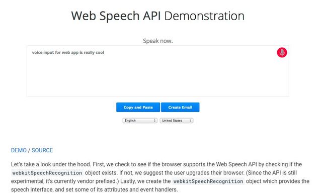
Voice-search is becoming more popular, and site design must keep up. With more and more voice searches being made every day, it’ll be exciting to see how web design can incorporate voice chatbots and virtual assistants into the broader approach to web design, and what it means in the future.
Sorina’s prediction: more websites will include voice search as an alternative to regular text search, making them more accessible.
The 90s are back
There will always be a place for nostalgia, and that place will be the internet in 2022. With the youngest 90s baby already 22 years old, the early internet aesthetic will rule supreme in 2022 as actual 90s kids channel their nostalgia into the area where they spent all of their time: the internet, in all its neon popup glory. Add in the popularity of lo-fi music and the TikTok filter machine, and the 90s are making a big comeback on the web.
Google’s Page Experience Improvement
According to some designers, this has been in the works since the internet’s inception – and it’s finally being formalized.
That’s a nice thing.
The Google Page Experience update altered the way Google’s engines analyze web pages, allowing them to load faster and more efficiently. It transforms the way designers approach a web page by providing a better page experience and a faster loading speed.
Websites that appear lovely but have features that stutter or skip disrupt the user’s immersion. Similarly, websites that load quickly but contain unappealing aspects may lose your attention.
“This is actually going to positively challenge designers to be as ruthless in their approach as possible,” they explains. Despite its openness in comparison to paper, the web has a unique set of underlying ideas or limits that we’ve been quite free and easygoing about so far. Something as easy as keeping your selections limited yet unified across online projects is an apparent but vital starting point, but this puts more of an engineering spin on web design than anything else – it has to look beautiful and operate even better. We must design with the end-user in mind, not just ‘does it look good,’ but also ‘do I really know I’m on a website.’
Are you looking for a WordPress Development Company? Check out this list of WordPress Web Designers and agencies.
What Will Web Design Trends 2022 Look Like?
It’s important to remember that these changes aren’t occurring simply because designers became bored with the previous set of trends or because last year’s trends no longer apply. We’re on the verge of a major shift in how the internet operates.
That shift has already occurred in some ways. This is new: blockchain, bitcoin, NFTs, metaverses, and entertainment over everything else.
And designers must adapt to it.
We discussed the why.
Here’s how it’s done.
One-Page Age
The world shrank dramatically as a result of the lockdown. You could not even travel overnight. You had to stay inside. You couldn’t go to events you’d been looking forward to or try new things.
Those constraints continue to come and go and will do so for some time.
One-page websites exist to make the best of a bad situation.
The experience of doing something, of being somewhere, is maximized by containing everything on one interactive webpage: there’s no burger menu to take you out of it, or traditional page set-up to remind you you’re on a website. All you have to do is go to the homepage, find the article, find the micro-site, and read the story.
The cornerstones are animated in-text elements, tiny animations, and amazing visual design.
Point-and-Click
Do you remember the good old days of old-fashioned internet design?
So, good news: it’s improving. It’s been on the rise since 2021, but 2022 will bring back the 90s point-and-click nostalgia.
Nostalgia is profitable.
It has always been so.
But this is more than just nostalgia.
Before the web was standardized, socialised, or (barely) sanitized, it was full of easter eggs and HTML coding tricks, as well as figuring out new ways to apply the same three elements in different configurations. Back in the day, community efforts to create websites that worked beautifully and had little tricks for users to find what you did on the web.
People are sick and tired of websites that exist solely to sell a product. Websites that can capture some of the excitement of connecting to the internet in the 1990s and falling down a coding rabbit hole will see their efforts rewarded handsomely. Giving people a talking point and a no-strings-attached adventure is an excellent way to keep them coming back because they want to in a time when the connection is particularly important and ever more difficult to create.
Customized Page View
Some people prefer to read their articles in the dark. Some people, however, do not.
By 2022, those design options will be a part of every web design strategy. Tailoring to specifications – smaller text, bigger text, different colours, dark mode, light mode – is currently prevalent in everything from apps to smart phones. As a matter of course, it will be extended to the web.
Customizing a website to meet personal needs creates a connection and makes the website more accessible to everyone. We’re living in a time when people want the option to change things – not because they need it, but because it’s more convenient.
Positivity
We could all use some good news to balance out the bad.
Websites will lean toward the positive in 2022. Light, bright colours, upbeat music, and an emphasis on the positive.
It’s more than just altruism.
There’s more than enough bad news to go around. People are sick of hearing about it, of being bombarded with reasons to be concerned, of feeling stressed, sad, and alone. Websites that can bring back a little happiness and connect with their visitors will see an increase in traffic.
Tiny Animations
There’s a lot of interesting stuff on the internet.
So much so that websites, particularly those with longform content, may struggle to keep their audiences where they need them.
Tiny animations can assist in keeping the brain focused on your page. Tiny animations sprinkled throughout a piece of longform content help to keep people interested.
We understand. There’s already so much to remember that long-form content and static web pages appear to be a waste of time. Tiny animations provide a happy medium between emphasising content and losing the attention of a frazzled audience.
Designer’s Fantasy
Static images are still in use.
However, there will be fewer of them.
For 2022, design elements are on the rise, with websites choosing less stock photography and more custom design that truly puts your personality where your site (or social media!) is. This trend also capitalises on a general shift in human behaviour: a sudden shift toward hyper-custom, hyper-personalized content and design that’s built to stand out above what’s been popular for the last ten years.
Andrea identifies a few that he believes will have a greater impact on how web design is approached in 2022.
Double Aesthetic
The Art Deco revival began a year ago, but we haven’t seen the full extent of its potential until now. Andrea believes that Art Deco is an excellent trend for 2022 and the rise of personalised content because of the minimalism that drives it. Art Deco, with its fundamentally simple design, can be both contemporary and classic and can accommodate a wide range of materials, mediums, and brand requirements.
As the concept of web design evolves from an idea to a discipline, it’s fascinating to see how changes occur and how close they are aesthetical to Web 1.0.
2022 will be a lot of things, but boring will not be one of them. We’re looking at a web that’s become more accessible, louder, customizable, and easy to adapt to.
Everything will change as a result of it.
We can hardly wait to get our hands on it.
FAQs
- What constitutes a good website in 2021?
When determining the quality of a website, several factors must be considered, including design, usability, mobile optimization, impressive content, and SEO.
2. What Features Portray a Good Website Design?
Minimalism is a timeless design trend that continues to be popular among today’s best website designs of 2020. This technique’s elegant, beautiful, and simple appearance makes it highly usable, resulting in a delightful user experience.
3. What makes a website appealing?
Beautiful websites have visuals that entice users to check out a business. They help to balance out your page and break up the text. You can use a variety of visual elements on your page, such as photos, videos, and infographics.
10 Web Design Trends in 2020
Here are what our research indicates and what we think the top ten web design trends will include:
- Bright colours and colour blocks.
- Larger fonts.
- Better use of whitespace.
- Dark mode.
- More 3D.
- Increased minimalism.
- Hidden navigation
- Increased use of parallax design.
- Custom illustrations.
- Voice.
As you can see, some of these are continuations of current trends while others take older trends and change them up into something new. We will also be suggesting a way to achieve this in your next web design project.
1. Bright colours and colour blocks
We have always been fans of colour so it’s great to see more colour becoming a web design trend this year. We expect to see a lot more use of louder, bright and more standout colours in web designs.
A bright main colour with a complementing or contrasting secondary colour is going to explode. We saw some big brands adopt this style late last year and we think it’s going to accelerate.
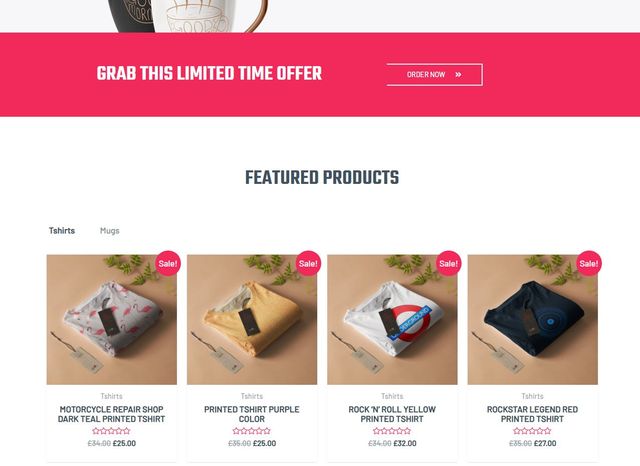
eCommerce in particular benefits from bold colour choices
Colour blocks are also going to be influential. Sectioning pages off with colour blocks allows designers to break up pages into bite-size pieces while working well on mobile or desktop. Grids also let you tell a story in an organized and linear way.
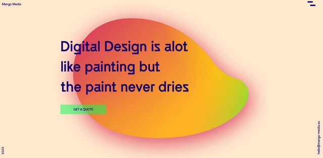
The below example by Mango Media blends vibrant colours with great font choice, a strong illustration and nice shading to deliver an exceptional first impression. It is this quality delivery that we think will be a prime web design trend during 2020.
Looking to achieve a similar design? Check out the below.
Divi LMS pack
The Divi LMS pack makes great use of colour blocks and whitespace to deliver a very well balanced theme. The use of colour is very modern and gives the theme a contemporary feel without using gimmicks.
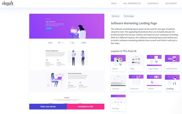
Divi Software Marketing pack
The Divi Software Marketing pack is similar. It uses a bold purple colour scheme with nice page balance, simple fonts, unique illustrations and good use of white space. Another example of contemporary design that uses the latest trends without relying on superfluous elements.
Check out the Software Marketing Pack Layout
Neve Mountain Bike Race theme
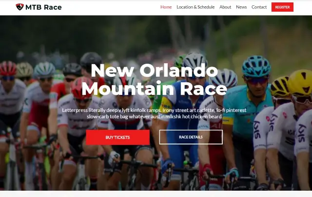
The Neve Mountain Bike Race theme is another fine example of font use, colour blocks and white space. The page is very balanced and could be useful for many types of business, not just leisure. It’s great to see commercially available web themes of this quality!
See the Neve Mountain Bike Demo Live
2. Larger fonts
Larger and bolder fonts are going to be big this year. Typography has always been essential in web design but we are seeing a definite shift towards fewer words in larger or bolder type.
We think this will be a definite web design trend through 2020.
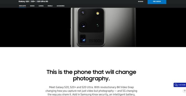
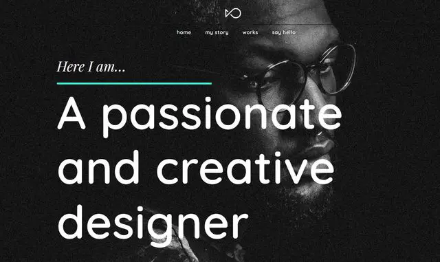
Larger and bolder fonts help reinforce the message and alongside clever headlines and calls to action can be more powerful than imagery in evoking a response. The likes of Samsung has already embraced the power of large type and we expect other brands and many smaller businesses to emulate this success. You can see this in action in the screenshot above from the Samsung website.
Large and bold fonts with the correct font choice can be very impactful. There are hundreds of clean fonts around that would work incredibly well on new designs so choice is certainly not something designers are short of.
Templatemonster Journeo theme
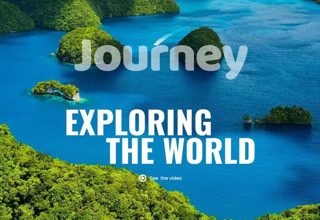
The Templatemonster Journeo theme is the perfect blend of strong imagery, colour blocks and font use. Scroll further down the page and you will also see good use of white space and blocks of content to provide a very modern yet balanced page.
Hestia Pro from Themeisle
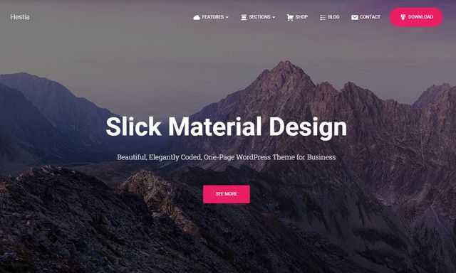
Hestia Pro from Themeisle is another example of good font choice, colour pops and blocks and intelligent use of white space. This is another contemporary theme that looks cutting edge while also being realistic for a modern business.
3. Better use of whitespace
Whitespace has always been important in good page design and we expect that to come even more to the fore this year. With the rise of strong colours and bold fonts, the use of empty space is going to be essential for these other web design trends to work. Plus, minimalism is still a strong trend and we don’t expect to see the end of that anytime soon.
Expect to see a lot more empty space on web pages with a lot of attention given to banners, larger headlines, colour blocks and imagery. It takes a great eye to effectively balance content and empty space and usually a great negotiator to convince clients it’s a good idea. We expect all those things to be a trend design trend in 2020.
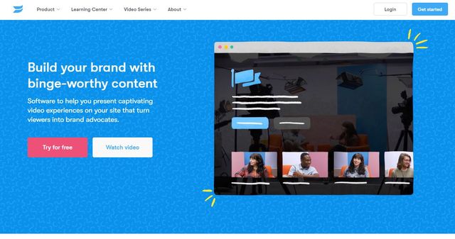
Wistia is a good example of how empty space is used well on a page. The pages still convey a lot of information but show perfect balance between page content and empty space.
StudioPress Foodie Pro Theme
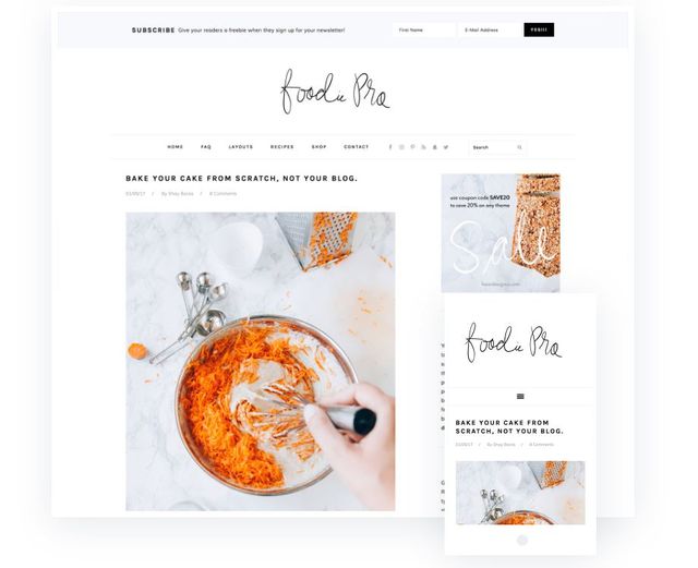
The StudioPress Foodie Pro Theme is another minimalist theme with great use of font, whitespace and minimalism. It works well for its food theme intent but could be customized to fit other industries too. Another worthwhile theme that works on mobile.
Check Foodie Pro Below or Visit Demo
Astra Custom Printing Pro
The Astra Custom Printing Pro theme shows great use of whitespace, font, colour and imagery on an eCommerce theme. The page is very attractive and draws the eye to the products while minimising web content to complement that intent.
Check out the Astra Custom Printing Pro
4. Dark mode
With more apps offering a dark mode, we expect websites to begin offering the same. Perhaps a colour switcher at the top of the page so the user has a choice of using light or dark modes depending on the device or situation.
There is a lot that goes into dark design, but done right it can offer a feeling of luxury and exclusivity to a page. Alternatively, it can make a page easier to read on some devices or in low light conditions.
Browsers and browser plugins are increasingly adding ‘force dark mode’ tools to manipulate even light designs so they go dark. As this is an increasing trend, you may as well incorporate it into your pages so you control the end result!
Like whitespace, dark backgrounds also feed into the other web design trends of the year, bold colours, large font and minimalism can all work together to deliver an exceptional user experience. Just one of the reasons why we think dark designs and dark modes will rule in 2020.
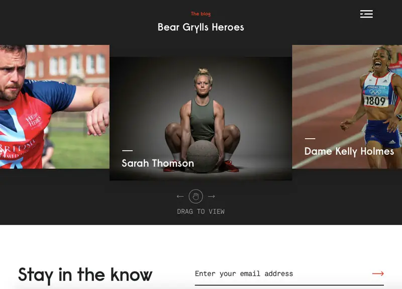
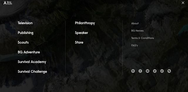
The Bear Grylls website (pictured above) is a good example of dark mode done well. It is also a great example of strong font, great imagery and minimalist navigation too!
Themeforest Jupiter theme
The Themeforest Jupiter theme demonstrates what we mean about dark website designs, strong colours, and fantastic font choice. It’s a striking theme that stands out immediately and gets the core message across in the first 2 seconds. Not much more need be said about this one!
The larger the font, the fewer examples of it you should have on a page. This leads us nicely onto…
5. More 3D
Many web designers previously avoided 3D imagery because it would take time to render.
Improvements in both design tools and device capability means that 3D is no longer out of scope when designing web pages. We think this will feed a new web design trend in 2020, that of 3D images and web content.
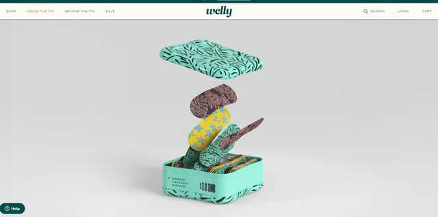
The Welly website (pictured above) is a great example of 3D in action and doesn’t take any longer to load than a standard page. This does take a lot of skill to design an interactive 3D image without causing slow loading but done well, it could create an awesome effect that makes a page stand out from the crowd.
This is one of those trends that demand the highest possible quality in terms of layout and animation. There is no room for second best when working in 3D so this could prove as much as a challenge as an opportunity!
Many think 3D design keeps a visitor on the page for longer and increases interaction. That and the fact it looks very cool is why we think 3D is going to be big this year.
6. Increased minimalism
Minimal design works everywhere. On desktop, on mobile, on web pages, apps and anything with a UI. It is not a new trend by any means but we think it will increase in popularity throughout 2020.
Minimalism is one of the hardest web design techniques to get right (though we have discussed it in a lot of detail here). It takes real skill to be able to balance a web page properly while satisfying the needs of the design, the client and the audience.
Minimalism is compatible with larger fonts, bolder colours, dark mode, custom illustrations and the many other web design trends we are seeing right now. It also works incredibly well on smaller screens which is why we think it will explode this year.
Minimalism fits in with our need for speed, desire to remain on task and little patience for fluff or unnecessary flourishes in web design.
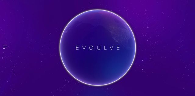
Evoulve (pictured above) is an excellent example of minimalist design that uses colour and font very well. Even the navigation is kept to a minimum!
Templatemonster Kuba theme
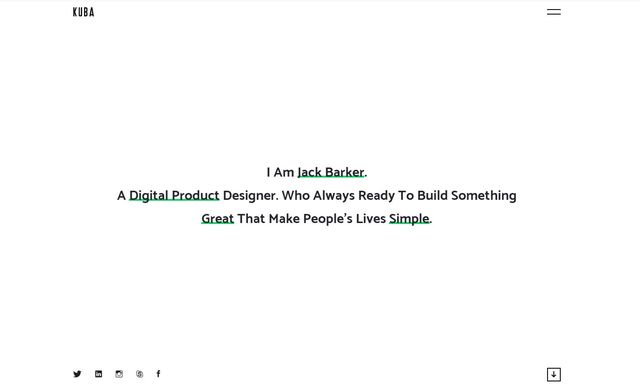
The Templatemonster Kuba theme is a masterclass in minimalism. The lack of things to see and do works to the page’s benefit and showcases the elements the designer wants you to see. It loads quickly and works on mobile too.
StudioPress Breakthrough Pro Theme
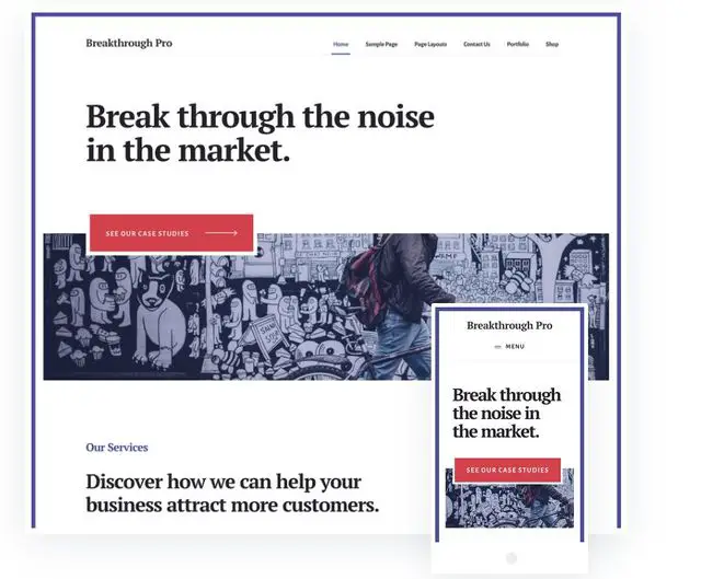
The StudioPress Breakthrough Theme is an excellent example of minimalist design with bold fonts and little blocks of colour. There is also good use of whitespace throughout the theme that translates well on the mobile version too.
7. Hidden navigation
As mentioned above, minimalism works hand in hand with hidden or minimal navigation. We think this is another design trend we will see during 2020. Most web users are familiar enough with website design that they know that if a menu isn’t immediately visible, it will be on the page somewhere. As long as the design is clear enough, we think that’s more than enough to encourage hidden navigation.
While essential for some designs, navigation and menus take up a lot of screen real estate. The smaller the screen, the more compact the design needs to be. Hidden navigation solves that. As long as the overall design makes it clear where the navigation can be found of course!
The Mill website is a great example of hidden navigation done well.
Hidden navigation does present a challenge though. Studies have shown that hidden navigation can impact time on page, interaction and visitor satisfaction. Care will have to be taken to match minimalism with good design alongside brand and audience fit.
Themeforest Salient theme
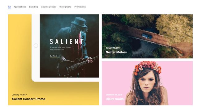
The Themeforest Salient theme includes many of the web design themes we have talked about. Colour, whitespace, font, blocks, minimalist navigation and great design to deliver a very modern theme that would work for all kinds of portfolio types.
8. Increased use of parallax design
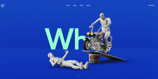
Parallax design is nothing new but we think we are going to be seeing a lot more of it this year. This design style was often left to entry-level web designs or template marketplaces where it served no real purpose and made no real impact. Designs like the one at ToyFight.co will change all that.
Better animation tools and techniques means creating genuinely accomplished parallax effects that work across browsers and devices to make a real impact. Along with good colour choice, clever imagery or illustrations, and good page balance, there is no reason why you cannot tell a compelling story through a scrolling page.
Astra Yoga Instructor
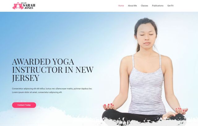
The Astra Yoga Instructor theme is another that uses modern trends of strong imagery, colour use, good font size, colour and choice and a neat parallax effect with the logo in the background. This is an excellent theme for its niche and works well.
Check out Astra Examples with Parallax
9. Custom illustrations
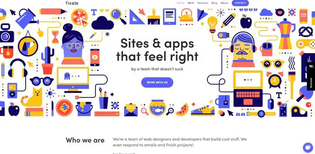
Custom illustrations are a way for a brand to really stand out. Forget stock images or mass-market vectors, custom illustration are where it’s at. Built within the brand colour scheme, truly original illustrations can be a powerful way to engage and to evoke emotion and an outcome. We think this is going to grow exponentially this year.
The benefit of custom illustrations is that they can be continually updated, configured to meet a mood or situation and can be used differently across devices. They can also be paired with animations to deliver an involving experience without slowing the page down or getting in the way of the customer journey. Fixate (shown above) is a great example of custom illustration that works to great effect.
They can involve extra expense during the development phase but most graphic designers can turn around illustrations fairly quickly. This is yet another benefit of using them.
10. Voice
Voice is becoming increasingly relevant on the internet. Search is already having to implement voice and web design will have to follow. According to this survey, 65% of web users aged between 25-49 will use voice to interact with their devices. Using voice in page design as well as navigation and search is a logical evolution. One we think will be a key web design trend in 2020.
Siri, Alexa, Google Now and Cortana have all introduced us to voice commands to one degree or another. Our increased dependence on mobile provides the ideal opportunity to use voice in search so why not website navigation and interaction too?
Voice User Interfacing also improves the accessibility of a website, improving access for all abilities. Various countries are introducing more stringent accessibility laws but making a website available to all is a core tenet of both the internet and the world wide web so why wouldn’t we integrate voice into a website.
This guide goes into the impact of voice on design in great detail. Well worth a read. As is Google’s guide to their voice-driven web app API.
Summing up Web Design Trends for 2020
The web design trends we think will rule the web in 2020 are mainly evolutions of existing themes. There is nothing completely new here but there is still a lot to look forward to whether you’re a web user or designer.
One reason we find ourselves excited about all of these is that they offer a genuine challenge to web designers. Gone are the days of template pages and turnkey design.
Now is the time of individuality, customized fonts and illustrations, perfectly balanced web pages with whitespace and imagery and a truly personal browsing experience. Add in functionality such as 3D, much-improved parallax scrolling and voice and you have a more usable web for everyone. That has to be a trend worth following!
Do you agree with our trend selection? Have ideas of other web design trends this year? Tell us about them in the comments section below!
Please leave a useful comment with your thoughts, then share this on your Facebook group(s) who would find this useful and let's reap the benefits together. Thank you for sharing and being nice!
Disclosure: This page may contain links to external sites for products which we love and wholeheartedly recommend. If you buy products we suggest, we may earn a referral fee. Such fees do not influence our recommendations and we do not accept payments for positive reviews.

