
Delicious menus and exceptional service keep customers returning to your restaurant, but how do you get them in when they don't know about you? A good part of pushing up your reputation consist of a special, secret ingredient. That secret ingredient is great restaurant logos make for great starting points for your food establishment.
The best restaurant logos will help you stand out among the already crowded culinary field. It's what draws potential customers' attention, sets the tone, and can even spark debate on social media and food blogs.
These restaurant logo designs below are all fantastic examples of how design can help your restaurant (or pub, cafe, or food truck) succeed even more.
Having a great restaurant logo is important whether you create culinary delicacies or serve pub grub and beer because you want to be recognized.
In this article, we'll walk you through many of the delicious restaurant logo concepts that are sure to pique your interest and tantalize your taste buds.
{autotoc}
What differentiates the best restaurant logos from the rest?
When it comes to designing a restaurant logo (or designing any logo for that matter), there are a lot of factors to consider: cuisine, location, style, personality, and, perhaps most importantly, your customers.
The importance of thinking through all of these questions ahead of time, according to Louise Fili, an award-winning Italian-American graphic designer who specializes in brand development for food packaging and restaurants, is all about "knowing what you don't know."
This will give you a good place to begin, no matter where you are with your brand.
Begin by identifying every aspect of your restaurant's personality, such as the atmosphere, decor and the way it has been constructed, food type, cuisine region, and price point. Then think about how design elements can help to elevate that.
Bold graphics, for example, may be appropriate for modern eateries, but they may not be appropriate for a laid-back cafe or a more traditional setting. Make sure you maintain this personality throughout your entire design.
Your logo should help attract new customers while also bringing back old ones, which is why it's crucial to know who your target audience is and what visuals they expect and enjoy.
Who is seated at your table or waiting for a drink at the bar? Speak directly to them about their requirements.
Finally, consider how your logo will appear on the gleaming, massive sign that greets your customers. The best restaurant logos look fantastic there and anywhere else you'd like to display them.
60+ Great Restaurant Logos
Upscale restaurant logos
The ambiance of an unforgettable fine dining experience can be masterfully tied in with elegant touches and extravagant visuals. The decadence of your restaurant should be reflected in your logo.
Hand-drawn elements convey precision and purpose, while nostalgic fonts evoke a more sentimental and romantic mood.
Whether you prefer a more minimalist look or are drawn to intricate details, your upscale, first-class vision can be expressed in a variety of ways.
Include elements that will resonate with your customers and what they will expect to find.
You can also incorporate design and decor elements to help introduce your customer to the ambience.

Logos for modern casual restaurants
Customers are welcome to return for any occasion at casual dining establishments, which helps to build strong communities. The fonts, graphics, and colors in your logo should be heavily influenced by your target customer base.
If the restuarant is more casual, your logo also has to be quite chill and even a bit playful.
Traditional restaurant logos
A traditional restaurant with classic food demands a traditional or classic design.
Your logo design should evoke a sense of familiarity and a long history. Simple fonts and vintage graphics, like the tried-and-true dishes you serve in your restaurant, evoke a sense of tradition.
Logos for fast food and takeout restaurants
In a fast-food restaurant, the food may be quick, but your brand image is just as important.
Even if your customers spend less time in your establishment than the majority, you must still capture the feeling of satisfaction through carefully designed graphics that deliver exactly what your customer will receive.
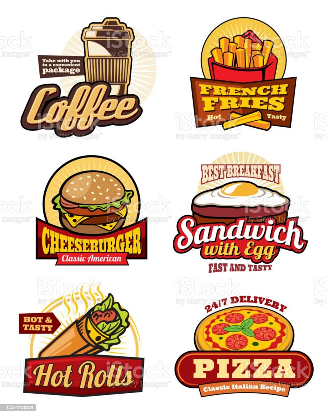
Logos for pubs, bars, and restaurants
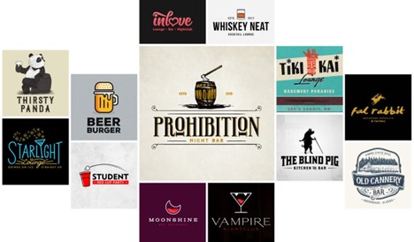
Customers linger in pubs and bars, so your logo design must convey the atmosphere of your establishment. Are they going to be seated behind industrial-chic facades?
Allow cold, utilitarian aesthetics to guide you. Is your bar dedicated to serving small-batch, natural wine in a more intimate setting?
To create a cleaner look with this type of logo, look for softer fonts and use white space. Concentrate on design aesthetics that evoke the appropriate mood.
Restaurant logos that are well-known / popular
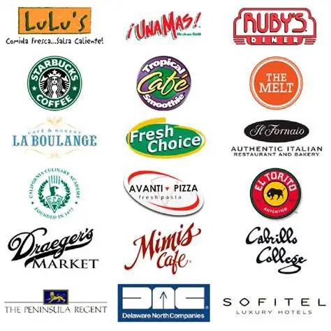
Looking to the best for inspiration is always a good idea. Here are some of the most recognizable and well-known restaurant logos to inspire you when creating your own.
These are the logos of the world's greatest restaurants, such as Starbucks, which have stood the test of time and whose success speaks for itself.
Fundamentals of logo design for restaurants
The creative process for developing a logo for your restaurant can be intimidating if you're just getting started. But first, a quick refresher.
Aesthetics, branding & marketing, composition, color theory, typography, and artistic skill are all part of logo design. In our article on how to design a logo, we give you a thorough overview of the process.
1. Pick the ideal restaurant name
Your restaurant must have a name before you can create a logo. You can stick to the safe route and name it after yourself or something related to the cuisine you're serving, but you can also get creative.
It is possible to achieve anything.
However, keep in mind that restaurant names and logos must complement each other. Take note of how the names and logos complement and enhance each other as you scroll through the examples above.
They have a way of putting each other in a good mood. You could also choose a logo that either illustrates or gives a second or deeper meaning to your restaurant's name.
2. Create a logo for your business
There is no such thing as a "best" logo. Those who best represent their brand are the most successful. The Coca-Cola logo's high-energy red and bold, script typography work well for the brand, but they might not work for a more relaxed brand like a yoga class or massage parlor.
So, before you do anything else, think about your brand. Are you the owner of a high-end restaurant or a modest family-friendly diner?
Is your specialty traditional cuisine or a one-of-a-kind fusion of culinary delights? Your design choices will be guided by your identity.
3. Be familiar with colors, shapes, and typography
Every color and shape in design evokes a different set of emotions. Logos that are primarily black, for example, appear more sophisticated, while logos built with circles appear friendlier.
That goes for typography as well. Serifs are more formal, while sans-serifs are more casual. Every design decision you make reflects on your company, so make wise choices.
Wrapping Up - What you need to know about getting a logo for your restaurant
You have several options for obtaining a logo for your restaurant:
1. Create a logo (DIY). You essentially create your logo from scratch with the help of a logo maker or other entry-level design software.
2. Hire a team of a design firm. Transfer all logo design responsibilities to a design agency and their team of specialists, but keep in mind that the extra talent will come at a cost.
3. Hire a freelancer to help you. Hire a freelance designer to create your logo, which will give you the benefit of being a professional at a fraction of the cost of an agency.
4. Organize a design competition. In a design competition, you submit a creative brief that includes your visual preferences and business objectives. Then, based on your brief, multiple designers from around the world submit samples. After that, you simply choose your favorite and begin revisions. You'll only have to pay for the sample you want.
DIY and logo makers are only recommended if you have a very limited budget. Your logo is an essential branding asset that should not be overlooked, and given how difficult logo design can be, if it isn't designed by a professional, it may not be as effective as it could be.
Design contests tap into the creativity of multiple designers, who come up with a variety of logo design ideas from which you can choose. If you're still undecided about which style and look is best for you, a logo design contest will show you all of your options.
Working directly with a freelancer is your best bet if you already know what look you want. Look through portfolios to find the right fit, then work with your designer to create a design you'll love.
Restaurant logo FAQs
What is the best color for a restaurant logo?
Muted red, shades of yellow and brown, and black are the best color choices for a restaurant logo.
What should the logo look like?
A good logo is distinctive, appropriate, practical, graphic, and simple in design, and it effectively communicates the brand's message. An effective logo usually has a concept or "meaning" that communicates the intended message through it's design.
What makes a great restaurant logo?
A good restaurant logo should be a good reflection of the brand. You might want to include these 8 elements in your restaurant's logo to attract customers. 1. Differentiation. 2. A typeface with personality. 3. Uniqueness to your own brand. 4. Good storytelling. 5. Balanced shapes. 6. Good Symmetry. 7. Color symmetry. 8. Negative space.
