If you're a photographer, your choice from the hundreds of photography WordPress themes available is going to be critical to your website's success - it's going to have to present your best work to ensure more business for you.
As a photographer, it’s indispensable to run a professional photography website to showcase a creative portfolio of your works to potential customers.
Whether you are a designer, photographer or videographer, through an online portfolio site you can find a new customer base, expand your reach, establish better contact with your audience, and boost your revenue as a result.
Launching a photography site on your own (especially if you do not have any coding or web design skills) will consume both time and money, if you decide that you want to build everything from scratch.
You can always hire a freelancer or a web design agency to get the job done. For example, Alex from ForegroundWeb specializes in creating websites for photographers so it would be a good idea to get in touch.
You can also try your hand at building the site on your own, but this will take a lot of time and effort. This is where the best photography WordPress themes can come in handy.
How To Find the Right WordPress Photography Themes To Create an Excellent Impression
There are hundreds of ready-made WordPress photography templates to choose from.
The WordPress community has become so large and diverse that you can get lost in the myriad number of providers and their pre-designed solutions.
For this reason, we have decided to help you narrow down the choice with this roundup of WordPress photography themes from the most reputable, tried and tested vendors only..
Before you decide on your pick from some of the best pre-designed templates there are a few tips that you need to take into account to make the right choice:
- A template that will be the foundation of your portfolio website should be from a reliable and well-established provider. Divi 4.0 (check out our review) comes to mind here as one of the most popular themes ever.
- A template needs to include customization options that will help you personalize it as necessary.
- When choosing a perfect template for your site, pay particular attention to the options included in the download. The pricing of the templates (especially if they are free) may or may not include customer support services, bundled additional plugins, child templates, updates, etc.
All of the photography portfolio WordPress themes that we have chosen for this article are fully editable and can be enhanced with many premium customization options.
They are ready to be personalized either through their built-in theme options or with the help of experienced web design professionals focused on working on WordPress themes.
Best WordPress Photography Themes 2026
Building a site based on a ready-made theme for photographers is not enough. When working on your project, you need to know a few web design tips on how to get started with a professional portfolio site.
This will help you to develop a site in accordance with the current web design principles.
This article has been built in a different format than most others. We will name one of our favourite themes, and then mention a tip to go with it.
We will not be discussing the features of each theme extensively. If you like a design, just click on the details or demo to see whether you think it fits what you had in mind.
1. Divi
Tip 1 - Use a tried and tested theme with excellent support.
If web design is not your strong point, it would be ideal that your website works for you, rather than you have to "work on it".
What we're saying is that you'll probably need to use a solid WordPress photography theme with an established and good reputation. And no product has a better reputation than Divi, with more than 860,000 satisfied customers!
Divi is an extremely versatile theme and page builder whose primary focus is on an easy user experience for both the owners and the visitors of the site. We've even compared it against Avada and it comes out as the winner.
It comes with a number of built-in layout packs, amongst them the Wedding Photographer Layout seen below.
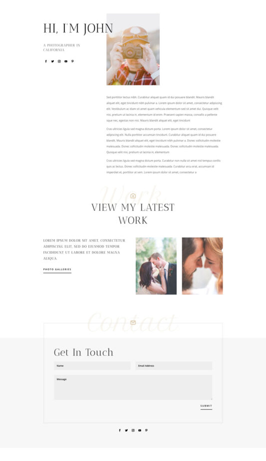
The beauty of this theme is that it can do absolutely anything you need it to. If you want to go minimal, you can. If you want to go with sliders, galleries, parallax and mosaics, you can too.
You can even create a full-blown webshop to sell your prints if you want to.
And you're in luck.
We've actually got a 10% OFF offer going on right now, so you'll get it at an absolute bargain price.
Get Divi with Photographer Layout at 10% OFF until April 2026
2. Fargo
Tip 2 - Make sure your site is an excellent showcase (with awesome photos)
If you are presenting your portfolio in a photo gallery, your photos, or maybe even some of the products you are selling (let's say different designs or t-shirts), your imagery is going to make the real difference.
A good photo with good lighting, taken in a studio by a good photographer, will make the real difference between a product/design which sells and another that falls flat on its face.
Your site's photos need to be able to do the selling for you.
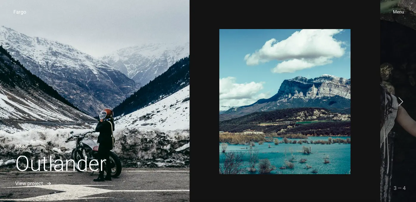
By using a theme for professional photographers such as Fargo, which of course, is fully responsive, your content, in particular, the photographs, take center-stage.
By using such a theme for WordPress, which is literally designed to make the imagery stand out, you can create an excellent portfolio of your photography work.
This theme from Pixelgrade together with your best work can really sell your services, without having to use a lot of textual content on your site. Let the results do the talking.
Tweak this theme through its theme options and go for some of the suggested color schemes and you're good to go!
3. Fiji 2
Tip 3 - Simplicity & minimalism make for the best photography themes.
Experienced and professional photographers know the value of portfolios built in a simple and minimalist style.
Using an interface with very little clutter, keeps the attention of the users focused on the essentials, bringing your creative works to the forefront - and making it much easier to convert.
For example, take a look at the Fiji 2 - WordPress theme for photographers.
With a fully responsive design, intended for building photography/portfolio sites, it features a unique, minimalist layout style that will also work well for presenting photography portfolio sites. This is all done using an innovative design that will keep the visitor engaged with the work of the photographer.
This well-balanced layout structure is intended to keep the users focused on the imagery.
Another thing you might take into consideration is choosing a photography theme for WordPress which contains multiple layouts, which you can then choose to apply to your site (or different pages) as necessary.
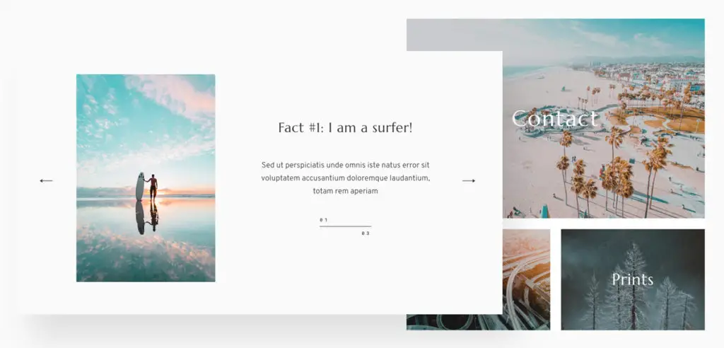
Fiji 2 is very easy to customize - you can either use and tweak the predefined layouts or build your pages by adding, removing, and drag & dropping various page blocks.
There are beautiful style kits (Fresh & Classic) included, but you can also customize the branding for a personal look that fits your own style.
We'd suggest having a look at the demo below - we're pretty sure you'll be amazed at the results which can be achieved.
Click for lowest price on Fiji 2 - 20% OFF (code: ray20) until April 2026
4. Astra
Tip 4 - Keep it Simple.
Most websites tend to complicate stuff, especially in the front-end.
Astra goes the other way - keeps things simple, so that it is your photography that shines, not the fancy design.
Have a look at the following portfolio starter site from Astra and you'll see what we mean.
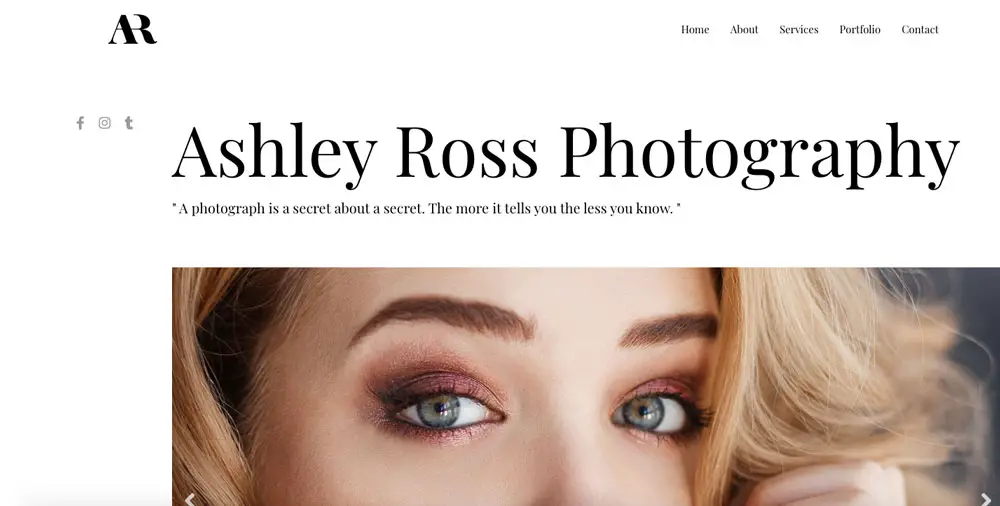
And the other great thing about the Astra theme is that it is really quick to load, even with an image-heavy site. This is something which is essential in today's web design and competitive SEO landscape. Check out our full Astra WordPress theme review here.
5. Revolution Pro
Tip 5 - Make sure your photography site has easy and intuitive navigation.
The visual aspect of your website is immensely important to photographers. That's why the gallery layouts available with the theme you chose are an essential aspect you need to take care of.
But, the way a user feels while browsing your content is no less important.
83% of web users will simply leave a website that requires many clicks to navigate, or is not intuitive to use.
So, make the navigation (and overall usability) of your pages as simple as possible to help you keep visitors browsing for as long as possible!
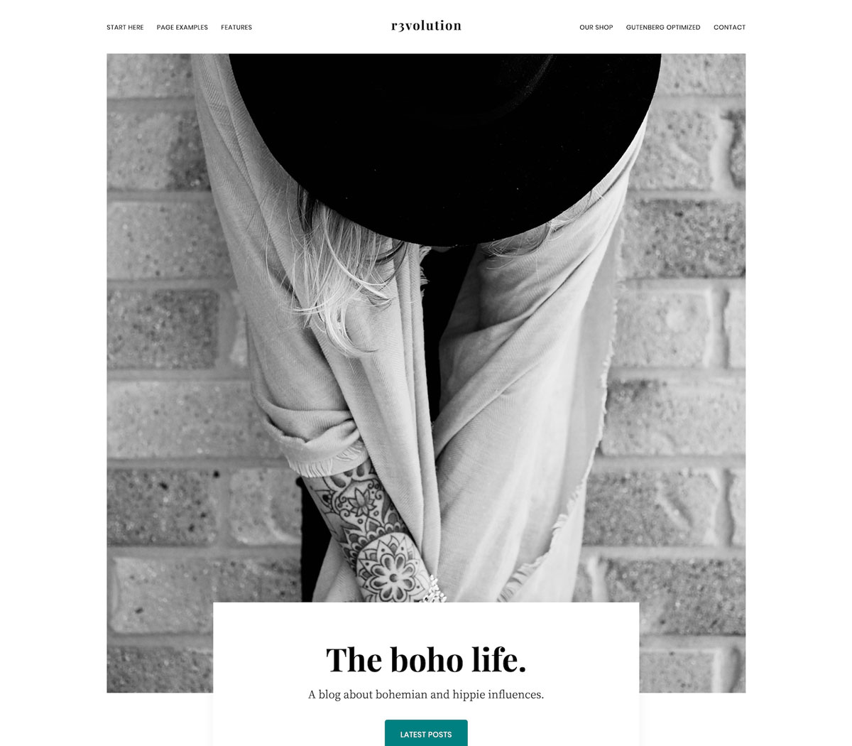
In terms of navigation patterns of your site, the menu bar should be placed where the web audience expects to see it, so avoid any fancy, "original" concepts of hiding a menu bar or making it hard to find.
It’s a win-win solution to organize it horizontally at the top of the page.
It should also include 5-6 menu items tops.
The fewer options you include, the easier it gets for users to find the content they want. Take a look at the Revolution Pro WordPress theme, designed for photographers. It includes 6 menu items only.
6. Julie Bernerro
Tip 6 - Clear & effective contact page with a strong call to action.
The best WordPress photography portfolio sites should be not only about an impressive showcase of creative artworks. These should also include easy-to-reach and clear contact pages and forms, making it possible for a client to reach you out with any questions whenever needed.
In most cases, a contact page should be accessed via the main navigation menu.
The simpler it looks the better.
The fewer fields it includes, the more usable it will be. For each additional field you add, expect a drop in the number of visitors who actually get in touch.
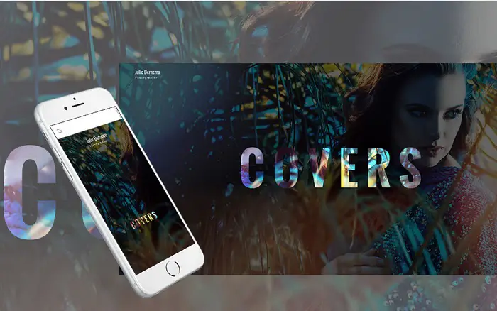
For example, the following design for a photographer portfolio website includes an easy-to-reach contact details page, which can be accessed with one click from the minimized menu icon.
Also, test on mobile devices that the page is fully responsive and that forms work well on small screens.
Incidentally, to be able to customize your site effectively, do make sure that the product you use has a built-in or supports a WordPress page builder such as Elementor (check out some of our page builder comparisons). This makes it easy to use drag and drop features to make quick changes to your site without any coding necessary.
7. Monstroid2 -
Tip 7 - Add a photographer's recommendations blog to your photography website
Integrating a blog into your photography portfolio site is an opportunity to keep your audience updated on the latest industry news, as well as promote services in a subtle way on your site (by focusing on providing good advice around photography needs).
While a photo gallery is great, your good advice earns you trust.
Blogs also bring lots of SEO benefits, making your website easier to find on the web.
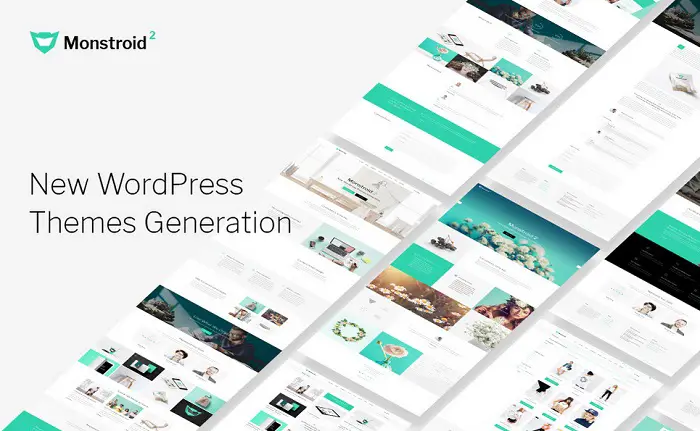
Read more: 19 step-by-step WordPress onpage SEO Checklist: an easy guide to boost trafficMonstroid Squared is a multipurpose WordPress template coming loaded with a fully-fledged blog.
It also includes a handful of pre-designed pages intended to help you get started with web projects of any level of complexity in the shortest time. It also has full support for the Elementor page builder, which is an absolutely fantastic tool, as you can see in our article here.
See the Live Demo of Monstroid2
8. Jon Bin
Tip 8 - Let them know who you are with a great About page
The About page is the second most often visited page on websites.
This is the place where current and prospective customers will go to find out more details about a person/organization standing behind a website.
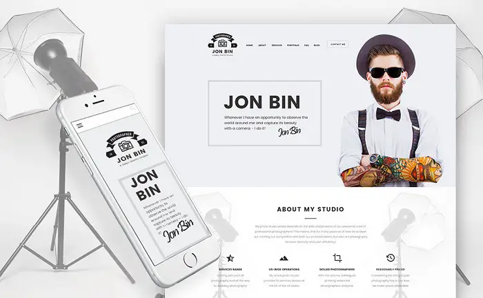
Clear and concise text should be accompanied by a portrait showing your style and persona, thus growing your chances to establish a better connection with the audience.
The following WordPress template is intended for building a personal portfolio website. It features a one-page layout, where the ‘About Me’ section is placed right below the introductory header image.
9. Addison
Tip 9 - Quality over quantity - Show only your best photographic work, not all of it
As a successful photographer, you will have to make some painful decisions to show only the best works from your portfolio. You probably have favorites that won't make it to the final site.
Because filling your site with endless galleries and images won’t bring desired results. Content and photo curation is a skill that every photographer aiming to build a reputable online presentation should master.
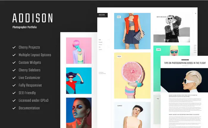
Showing only the best of your works, and the ones which hit the right spot, will help you promote your works and inspire visitors to get in touch. On seeing a stunning portfolio, the users are likely to be inspired to get in touch and hiring you.
The Addison Photographer Portfolio theme is a great example of a design where the quality of images is valued more than just the number of images added to the gallery.
10. VicHax
Tip 10 - Integrate WordPress photography themes with Social Networking
Social media sites are some of the most popular online marketing mediums that allow business owners to reach a wider audience - especially when it comes to visually compelling content.
People feel empowered when they share great imagery, especially stuff that tells a beautiful story. So your photographic work has a good chance of making a hit on social networks.
Especially, if you design it in a way that is designed to take advantage of social media. Both in terms of how you tell an emotional story and how you enable the technology to help you out with the virality.
Integrating social media options into your site you make your content more easily shareable and the best WordPress sites integrate this nicely into the design, with prominent and strategically placed CTA (Call to Action) buttons to ensure that your visitors hit the share button, or tag their friends.
Of course, the integration of your social accounts should not come at the expense of other contact details. Make sure that a contact form using one of the more popular WordPress plugins is present and is easily accessible and visible.
VicHax is a stunning example of a website where social networking is done right.

11. Interra
Tip 11 - Keep your users coming back to see your new photoshoots with Email Marketing
Email marketing is one most effective channels to build trust and deliver content to your audience.
While it is harder to grow an email audience list as opposed to a social media following, it’s still possible. And eventually, it has a better ROI too
Read More: 21 Essential Steps to Boost WordPress Email Subscriptions
Even though the audience and reach is typically smaller than on social media platforms, it is much more targeted.
These people have opted into your list, because they want to hear from you.
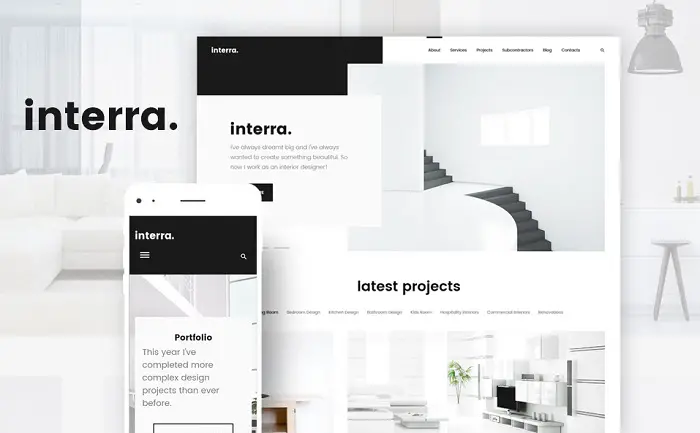
They want to be aware of your latest projects and updates. So do make sure that there is a custom contact form that is intended to increase your email list. Just like we did with the strategic placement of CTA buttons for sharing on social media, a good pop-up, once a user has engaged with your site can have an excellent conversion rate.
You could also make a great offer to pull them. Discounts, free advice, free high-res photos, a free consultancy call, or something else to lure them in can work wonders.
Every photography WordPress template should be integrated with a newsletter subscription form. Interra is a good example of how to integrate list-building forms.
If you need to make changes to the images and designs, you might use this photoshop free version available on this site.
12. Bailey
Tip 12 - Use High Contrast to bring out your work.
As a design rule, images always look better when placed on contrasting backgrounds.
Both black and white palettes work well to create an impressive portfolio showcase.
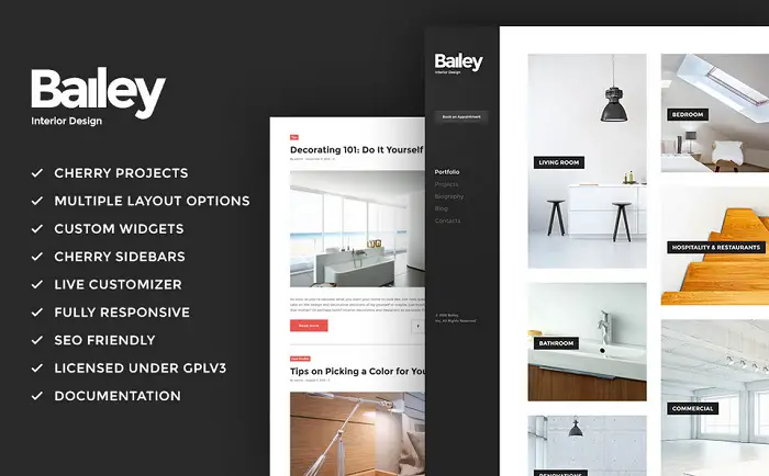
Contrasting backgrounds allow you to bring out all the colors of the photo, making it appear more vivid and breathtaking on device screens. Using a page builder also helps, because you can use predefined page templates that have the correct color contrasts already in place.
Bailey features a clean layout with clever use of whitespace, bringing out the best of the photographic elements placed on its pages.
13. REMI
Tip 13 - Use High-resolution Photos Only.
When potential customers land on your website, they expect to see a portfolio of your works in high resolution, particularly on their first visit.
Your online portfolio is meant to present your works in the highest quality possible, not low-quality images optimized for bandwidth or speed.
Whenever a person searches for a quality portfolio showcasing professional works of a designer or a photographer, he is ready to spend a few more seconds until the content of your pages loads.
Of course, it helps if there is an animation that shows that an image is loading, just so that we give the user the right expectations.
WordPress photography themes you consider should enable you to display your work not only in a clean design but in high-res quality too.
Remi is a great example of a ready-made design that not only features visuals of the highest quality but is also optimized for good performance in any web environments.

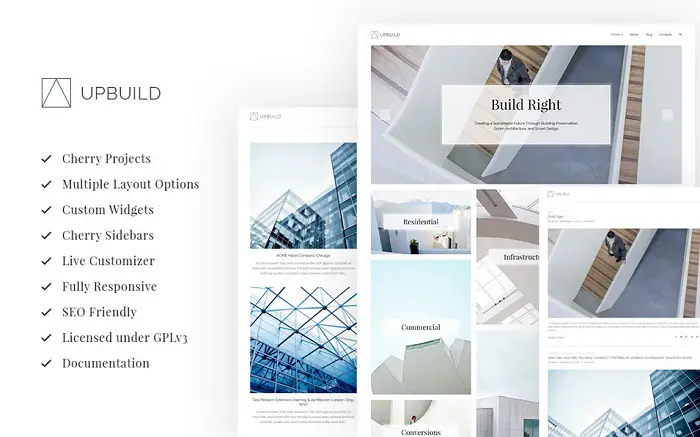
14. UpBuild
Tip 14 - Organize your photos strategically
A strategic organization of photos on a website is something that should be done with careful thought.
The strongest elements should be displayed first to attract most of the users’ attention. Always stick to this principle. Put your most successful works in the first places of a slideshow or a gallery.
It's also a good idea to place cool, quirky, or particular images at the end of the showcase.
In this way, you will leave a long-lasting impression on the visitor.
Keep this concept in mind when picking the best photography theme for your project. Make sure that it includes enough types of galleries and sliders to build your own photography display strategy.
Upbuild will manage this task perfectly.
15. Magic
Tip 15 - Consider Scrolling vs clicking
We’ve already discussed the importance of making your website look good on mobile device screen.
With this in mind and taking into account the growing demand usage of touchscreens, forcing the users to make a click to load more information can affect the UX of your portfolio site.
That is when various scrolling techniques can come in handy.
Designing a web page using scrolling can help you guide users with captivating storytelling. As the user scrolls down, the plot of your story is "revealed" just the way it should be.
It is way easier to look through the content shared on a site by scrolling down a page as opposed to having to click to view each image.
Magic multipurpose WordPress theme is the way to go for creative artists searching for an impressive way to showcase their portfolio and reveal stories through scrolling.

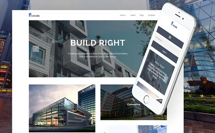
16. Archville
Tip 16 - Use photo images that expand to full width.
Making photographic images expand to full width will make your creative works shine. It allows for no distractions except a full focus on your work.
The technique is used in the Archville WordPress theme.
Live Demo and Archville Details
17. Adeline
Tip 17 - Get on a personal level.
Stock photos are dead.
They cannot add any personality to a web page. Instead of filling a site with stock images, artists should add photos of themselves to the pages of websites. This gives the site a much better personality and allows the visitor to get to know you.
People are interested in learning as many details about a person standing behind a website as possible and these images should feature both on the landing page and in "About" pages.
So, expand on your style, your preferences, your hobbies and tastes, even your fashion style! Write about them and add respective images on the pages of your site - it will create a better bond with your customers.
Heck, if you have a pet, post a photo with it as well. It will make you so much more relatable!
By sharing personal information you can help your visitors better associate with you. The layout of the Adeline theme is a perfect fit for representing some personal data alongside a creative portfolio showcase.

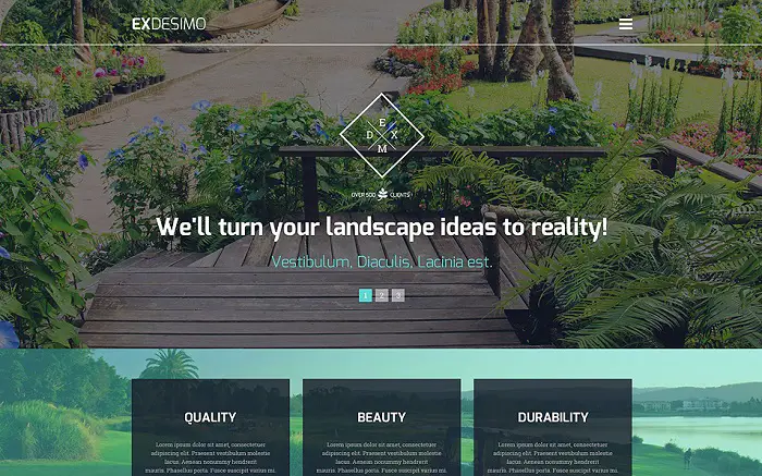
18. ExDesimo
Tip 18 - Use Videos to complement your photography.
A picture speaks a thousand words. But a video can deliver a thousand more.
Integrating videos in the background of your site or by simply uploading those to galleries you can deliver the message to the target audience more effectively. Videos also help to keep the users captivated with your storytelling.
Exdesimo uses the power of background videos to the fullest.
Live Demo and ExDesimo Details
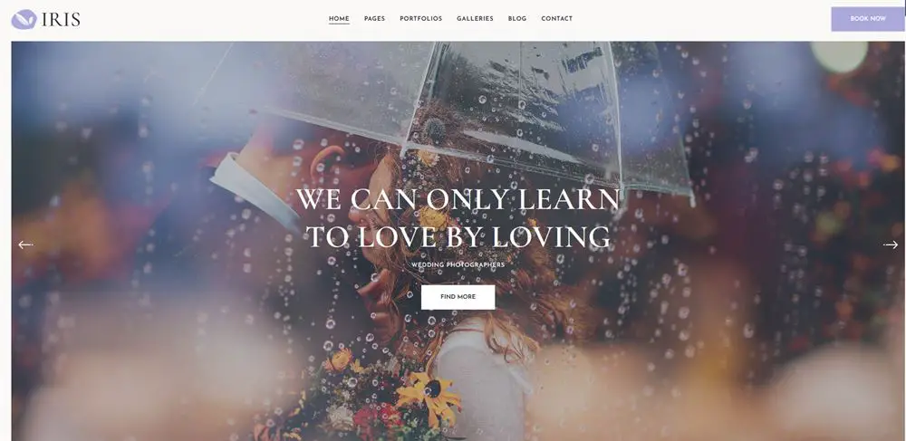
19. Iris
Tip 19 - Use smooth scrolling to complement with great imagery.
Using the smooth scrolling technique is not new to the web.
You can find it on websites on different topics, not only the ones used for photography portfolios, but anywhere where images can make an impact.
The smooth scrolling effect, keeps your audience immersed by creating an illusion of depth on the pages, whilst using complementary images to a piece of text. Scrolling is a very modern design, and you'll find that the best free WordPress themes support it today.
Added to the layout of Iris, the technique adds a sense of interactivity to the pages.
20. Mevis
Tip 20 - Use creative animations to give a photography website that edge.
Animation effects can be added to the background images of a web page, to the photo galleries and sliders, as well as image previews.
Using animation effects, you can make your portfolio website pop. You'll find that the WP Bakery page builder and plenty of others, integrate animations into their page templates.
As you preview the demo version of the Mevis, you will notice a custom animation effects that appear as you move your mouse or cursor over images.
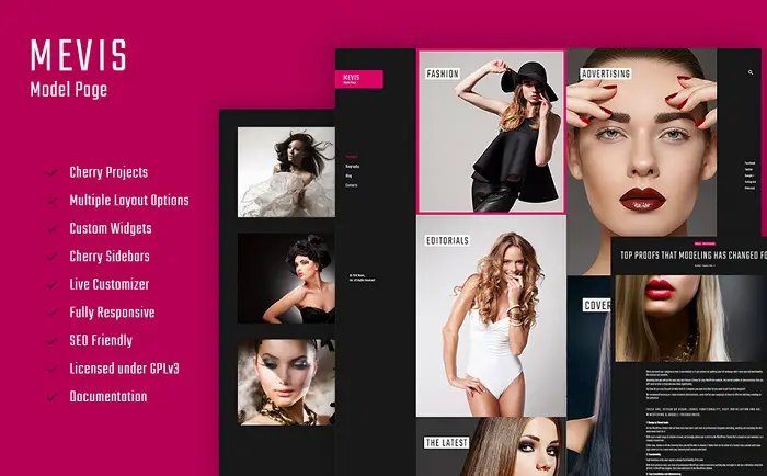
Live Dem + Mevis Model Details
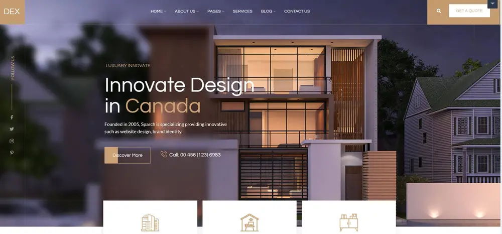
21. Dex
Tip 21 - Showcase your reputation with great user testimonials (Social proof)
User testimonials are the most powerful trust signals that a portfolio site can provide.
Whether this is a WordPress theme for photography or any other powerful theme designed for selling services, social proof and testimonials are a must.
While you can have professionally written marketing texts, nothing compares to the testimonial provided by a real customer (or several), on your landing page.
As people look through the testimonials shared by fellow clients, they can come to trust that you are a person/business they can rely on to meet their needs. As a result, this increases the likelihood of you getting hired.
User testimonials will do a great job of improving conversions for any type of website that sells products or services.
22. Architera
Tip 22 - Don't forget to add a Google Map to your WordPress photography theme.
Using an integrated map, users can familiarize themselves with the location of your office or photography studio.
This works particularly work if you are in close proximity to them because they will know how easy it is to visit you to discuss details of their photoshoot or other work with you.
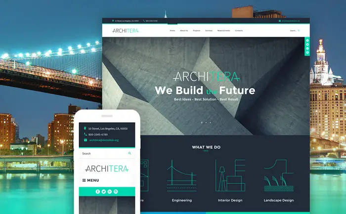
Architera, which is a full-screen product, is one of those customizable templates that can be used for photography portfolio sites also besides being a great choice as a premium WordPress photography theme.
At the footer of the page, you can find a usable Google map widget together with full contact details. As with all other WP sites, you can use custom widgets to add your contact details, location, and other relevant information.
Live Demo and Architera Details
We’re going to depart a little bit from the descriptions above. Rather than share more tips for setting up your photography website, we’re going to concentrate more on the themes.
We’re sure you’ve had enough of our suggestions, so let’s talk more about you and your needs!
23. Ultra
Tip 23 – Simple design to let your work shine.
Ultra is a multipurpose WordPress theme with lots of layouts covering many niches. One of which is photography.
The overall design of Ultra is great, with some nice touches that elevate it above the norm and some nice flourishes particularly useful for photography and photographer websites.
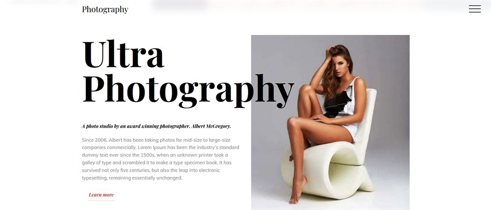
It’s a nice theme to work with as it uses the Themify Builder. Not as popular as Elementor or Beaver Builder but good at what it does. Once you figure out where all the controls are, it’s the same drag and drop functionality as all the others.
Navigation is straightforward, using a hamburger menu so all your attention is directed towards page content. It’s a divisive method, some people love it and some really don’t, so use it with care.
The portfolio page is particularly good. It’s a masonry layout with a simple white background to allow your images to be front and centre.
Overall, Ultra is a great theme for most uses and works well.
24. OceanWP
Tip 24 – Multipurpose theme for any website.
OceanWP is a regular in our lists of best WordPress themes. That’s no accident as the theme is very accomplished, easy to use, fast to load and has lots of readymade templates.
In fact, OceanWP has several templates for photography. We chose the fullscreen Photography template because it has everything we look for.
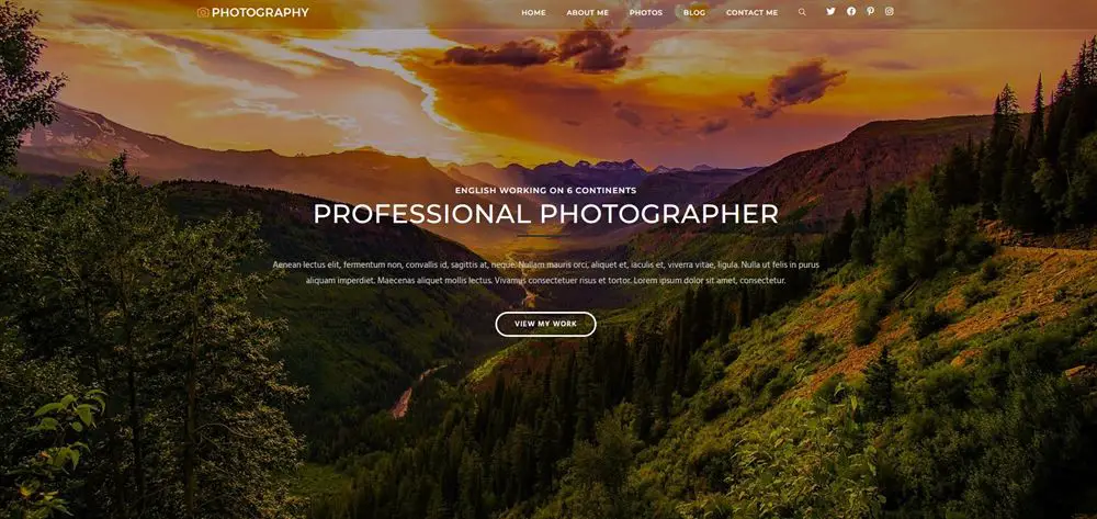
A fullscreen image front and centre, simple and logical navigation, a content area for biography or services and a large grid for a portfolio.
OceanWP works with both Elementor and the WordPress block editor and delivers lots of options within an easy to use framework.
It is fully responsive, SEO-friendly and includes most of the blocks you’ll ever need, including those for images and galleries.
That makes it ideal for photography as far as we’re concerned!
25. Neve
Tip 25 – Simple but effective for many niches.
Never is another regular here at CollectiveRay. This time its because of its speed and flexibility. There’s a free version of Neve that’s pretty good, with all the basics you need to build a website.
The premium versions add a header and footer builder and custom layout tools to help you take it further as well as access to premium templates.
The free Photography template we chose for the image is typical of Neve’s design. Simple, no-nonsense but does the job with a certain flair.
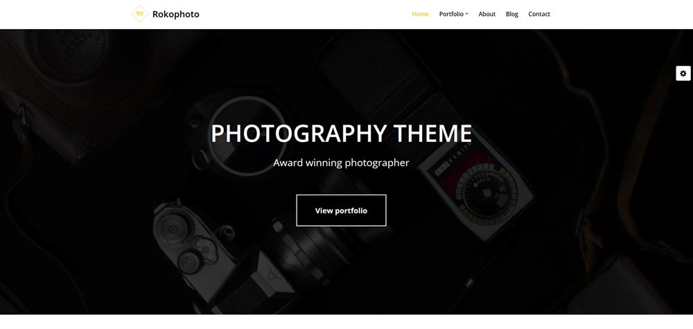
If you’re the type of photographer who likes to keep life simple, this could be the theme for you. Minimal page decoration and navigation and maximum screen real estate for your photographs.
What more could you need from a theme?
26. Essence Pro
Tip 26 – Expensive but could be worth the investment.
Essence Pro is a harder sell because it’s part of the rather expense Genesis Pro package. However, if you make websites for others or plan to make multiple sites, it could be a great investment.
The design of Essence Pro is very modern, flat with Scandi colours, alternating dark and light areas and a subtle brown contrast colour.
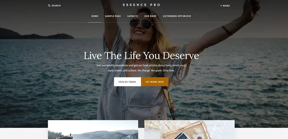
All designed to make the typography and imagery stand out.
If you’re a photographer, that’s the main thing you’re looking for. A WordPress theme that provides a framework for showing off your creations.
That’s why Essence Pro is in this list.
It’s easy to use, works with the WordPress block editor as well as Genesis, is fully responsive, SEO-friendly and can easily be turned into an online store as well as a photography portfolio.
27. Shutter Up
Shutter Up is a crisp, clean design that’s perfect for building a photography portfolio or resume website. It’s flat, minimalist and delivers an upmarket experience.
There’s a free and a premium version, both offer the styles and blocks you need to build an amazing website. The Pro version adds extra blocks and tools to add different content, but otherwise both versions deliver a very similar experience.
As you would expect, the theme is all about the images.
You’ll see a grid on the homepage where you can show off your work and optional content areas to add explanations, calls to action and whatever you like.
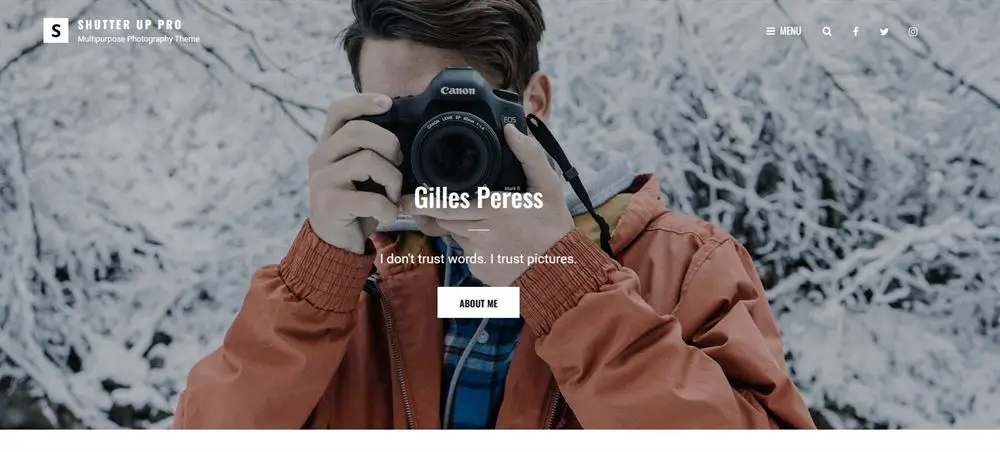
Shutter Up has built-in social media sections and a smart footer that adds extra engagement opportunities depending on how you use it.
28. Astra Photographer
Astra Photographer is one of the newer templates from the all-conquering Astra theme. It’s a fullscreen portfolio-style design with a dark background and fullscreen slider.
It makes a great first impression as it places imagery first. The Customizer menu on the right lets you switch from dark to light and change the contrast colour easily, as well as play around with the typography.
Like all Astra Starter Templates, Photographer is compatible with Elementor, WordPress block editor and most page builders.
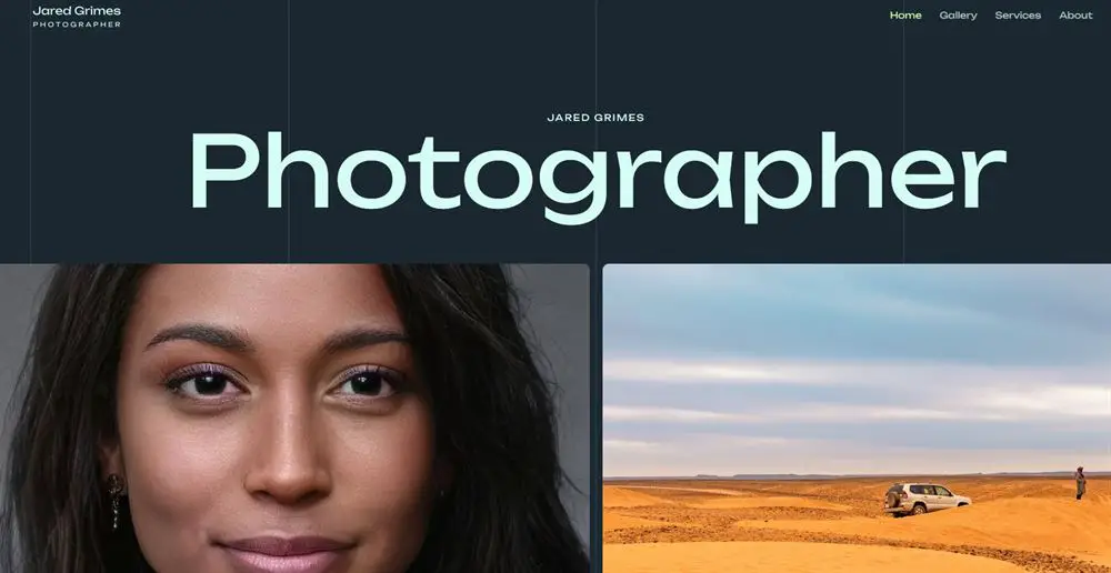
It’s also fast, fully responsive and SEO-friendly, covering all bases.
This template has a very modern design with flat images and animated page selectors over each image.
The gallery page is particularly good, with a sideways grid layout that can showcase your work easily.
29. Pixgraphy – Dare to be different with this great photography WordPress theme
Pixgraphy has a free and a premium version, both offer slightly different takes on the photography portfolio.
We prefer the premium version as it has more building blocks and will require a little less work to make it look amazing.
Both templates use fullscreen image sliders and powerful imagery to make a statement. The free version uses a traditional left-right slider while the premium version uses a vertical slider.
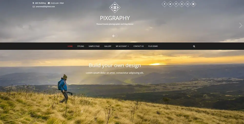
Typography is understated but strong enough to help you navigate, which is an excellent balance to make.
Scroll down the homepage and it opens into a grid-style portfolio that showcases images well with a hover effect for a short description.
Each image has its own page where you can tell its story and share related images as you see fit.
The gallery page is a reflection of the portfolio block on the homepage. A flat grid with images front and centre and an optional sidebar.
If you’re looking for something a little different, this could be it!
30. Photo Perfect
Photo Perfect is a very elegant theme that could be ideal for certain types of photographers. If you do weddings, portraits or similar, this could be the design you’re looking for.
It’s a stylish theme with large hero image in the centre and floating navigation bar. The image could be switched for a slider if you prefer.

There’s a search function in the header which may benefit busier photographers but can be easily removed if you don’t use it.
The page flows into an animated image grid with overlays for content and links that open seamlessly into a content page for each image.
It’s a very slick way to make a website can looks great as long as you have the hosting plan to do it justice.
If you plan to sell images as well as show them off, Photo Perfect has readymade store pages you could use to save time.
31. Phlox
Phlox is another very stylish WordPress photography theme. It uses dark design very well to create a feeling of exclusivity and luxury that could suit many photographers.
The theme is a combination of business website and portfolio so could work for agencies or photographers wanting to make a career with their website.
The hero section has a greyscale design with simple navigation and a small slider to one side. The page opens up in a colour grid and optional content areas you can build out as you like.
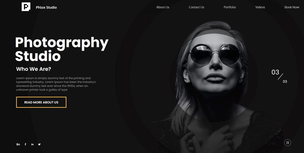
The theme also supports video and audio if you’re more of a multimedia creative.
Phlox is a very popular theme with over 200 templates covering most niches. Many are free and many premium.
Moist are compatible with page builders and the WordPress block editor so the theme is very easy to live with.
32. Coastline
Coastline is something a little different. It’s a fullscreen portfolio theme but with side navigation. It’s well-designed and looks great and could be just what you’re looking for.
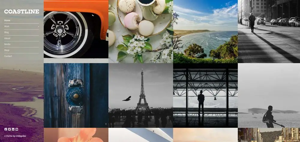
That side navigation has been styled well with background image and simple typography.
The rest of the page is made up of an image grid with hover effect that somehow manages to be low key but incredibly engaging at the same time.
That’s quite an accomplishment and makes this theme well worth checking out.
Select an image and you’re instantly taken to a white page with the image or image slider in the centre along with optional content areas underneath.
There’s a shop page already built if you want to sell your images and smart extra pages to build out your site.
Coastline is an excellent option for many types of photographers and will be as notable for being a little different as for the work you show off using it.
33. Inspiro PRO – Impactful WordPress Photography theme
Inspiro PRO is a dark theme that makes an instant impact. It opens with a video slider that engages immediately with a content overlay and simple top navigation.
The homepage flows down into a blog grid block and optional content blocks you can customize as you see fit.
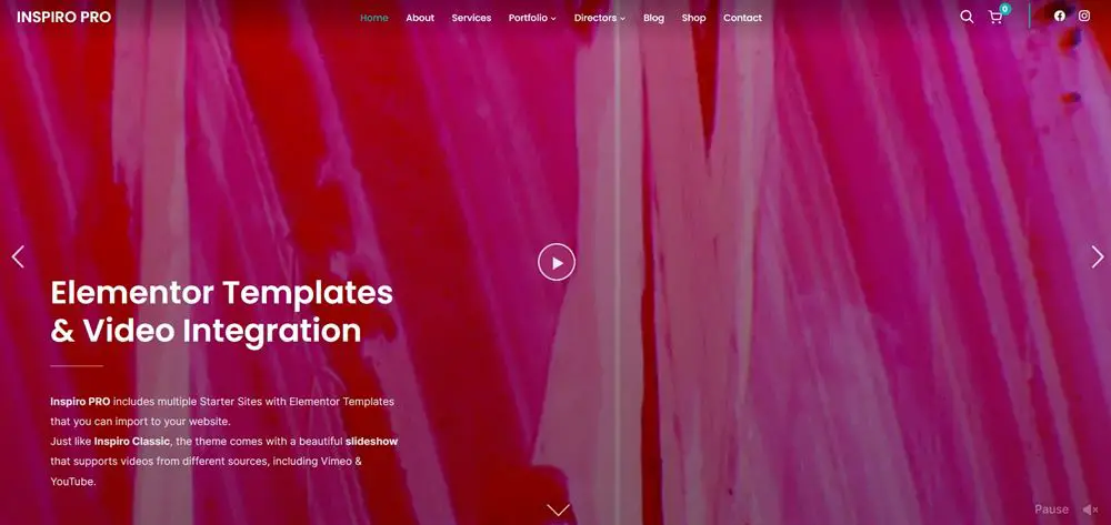
All images have hover effects that can add context or tell the story. Links take you to individual pages that show off each piece in much more detail.
The theme supports video, images and audio, so could be ideal for multimedia creatives. Autoplay video can be controversial, but in this header, it works very well. There is the option to pause it at will too.
The overall design is very accomplished, with some nice touches, great use of typography and some nice supplementary pages.
34. Lense
Lense is a very composed WordPress photography theme with side navigation like Coastline. Only this time, it’s on a whiter background with simpler design.
The main hero slider is manual and uses a slide control under the images. It’s a smart choice, giving the visitor the freedom to navigate your work as they want.
The side navigation uses modern sans serif fonts but you can change them at will.
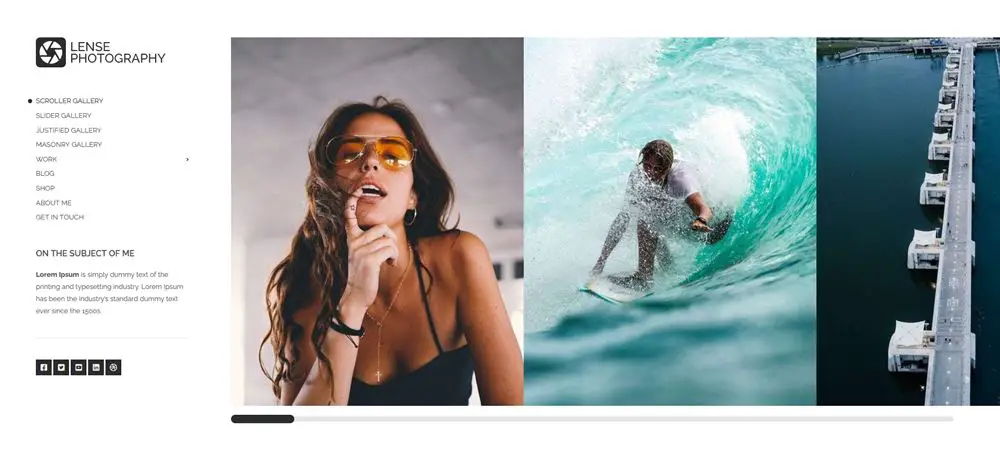
The simple white background helps your imagery stand out and provides the framework from which you could build an amazing portfolio.
Lense comes with a range of portfolio types you can choose and use as you see fit. We think the homepage slider works incredibly well so wouldn’t mess with that but inside pages can be configured to your personal taste.
Supplementary pages include different galleries, a blog, bio section and more. There’s also the obligatory social media integration so you can leverage it to promote your work.
35. Chique Pro
Chique Pro is all about the images. A well chosen image in the hero section of the demo shows you what an impact a design like this can have.
It’s another side navigation theme that manages to feel completely different to the others here.
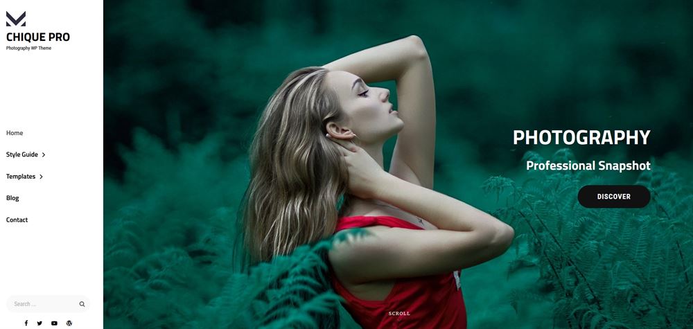
The theme forms a simple, elegant framework to support your images and seems content to stay out the way while browsing. That’s the mark of competent design.
The side menu is a simple monochrome affair with bolder fonts than Lense. We think it works equally well but for completely different reasons.
Each image has a hover effect for context or storytelling and an attractive image page where you can add explanatory content, add supplementary images or whatever you like.
Some themes achieve more with less and Chique Pro is one of those.
36. Photocrati
Photocrati is something completely different and last very definitely is not least!
This is a fullscreen image grid design that does nothing but showcase your images. There are several homepage styles to choose from, with this being the most engaging.
There are no hover or fancy effects here. It’s a simple select and see design where you’re taken to a fullscreen version of the image you selected.
That image can be standalone or part of a larger slideshow so each individual image can stand on its own or be included as part of a larger catalog.
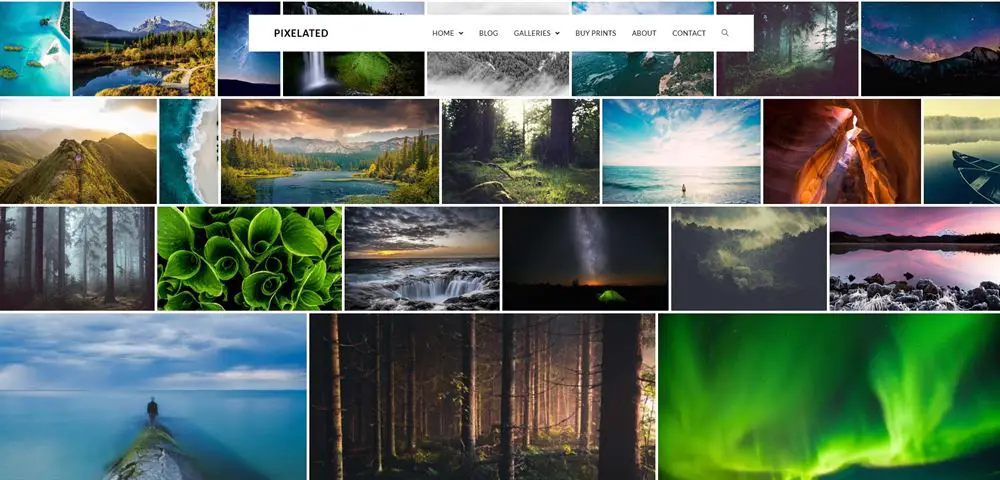
It’s a neat idea that delivers.
Photocrati also links to the developers automated print fulfilment service. It’s optional, but useful if you operate in the same region and want to sell prints.
A small but impressive extra feature that makes it stand out just a little more.
IMH
Do you want a fast website?
Who am I kidding? Don't we all?
So why do so many of us struggle?
The biggest challenge is usually finding a fast, reliable hosting company.
We've all been through the nightmares - support take takes forever or doesn't resolve our problem always blaming something on your side...
But the biggest bummer is that the website always feels slow.
At CollectiveRay we host with InMotion hosting and our website is stupid fast. We run on a custom stack of LightSpeed server setup on MariaDB with a PHP7.4 engine and fronted through Cloudflare.
Combined with our front-end optimizations we reliably server 6000 users every single day, with peaks of 50+ simultaneous users.
Want to get a fast setup like ours? Transfer your site for free to InMotion hosting and get our 50% OFF on current pricing.
Try InMotion Hosting with 50% OFF for CollectiveRay visitors in April 2026 ONLY!
Photography WordPress Theme Frequently Asked Questions
What is the best WordPress theme for photographers?
The best WordPress theme for photographers is probably Divi because you can use it to create any style of website that you want. But any of the above themes make for great photographer portfolio sites. It pretty much depends on what your style is. But remember, you'll have to let the imagery do the talking.
What is the best WordPress theme?
The best WordPress theme on the theme directory in WordPress is Astra. It has a top-rating of 5-stars from hundreds of thousands of customers and downloads. It has both a free version and a Pro version that gives a broader set of features. It is light, fast, customizable, and is one of the most popular themes (besides Divi) these days.
Do WordPress themes come with images?
No, most WordPress themes do not come with images, but some do. However, the images they come with are usually cheap or free stock photos, so it is not a very good idea to actually use these photos for your own site. They will leave a bad impression on your site. It is best to create a custom set of shots that bring out your own style and brand.
Is WordPress good for photography websites?
Yes, WordPress is great for photography websites for several reasons. First, there are several ready-made and excellent gallery-based themes and plugins that will ensure you can build the style of website you want. Second, WordPress is easy to use and to keep your website updated. Third, WordPress is popular, so you'll find plenty of support should you need anything. Fourth, using WordPress is cheap, you only need to pay for your premium theme and plugins and a yearly hosting fee. That's cheaper than most sites such as Wix or Squarespace.
How do I create a photography portfolio in WordPress?
Creating a photography portfolio in WordPress is very easy. You just need to selectone of the above WordPress photography themes, but it, install it on the WordPress hosting of your choice and you should be good to go. You then just need to add your own photography portfolio, but the overall process is relatively simple.
Is WordPres good for photography?
WordPress is definitely a great option for photographers looking to showcase their work online. It offers a wide range of themes and plugins specifically designed for photography websites, which makes it easy to create a visually stunning and professional-looking website. Additionally, WordPress offers a variety of options for displaying and organizing photos, such as galleries and portfolios, as well as easy integration with social media and e-commerce platforms. Furthermore, WordPress allows photographers to easily manage their website, and it also allows them to have complete control over their content, which is very important for photographers.
Conclusion - which WordPress photography theme do you prefer?
Make use of these WordPress portfolio theme proven tips to get started with a functional and user-friendly photography portfolio website. Also, pick one of these recommended and best photography WordPress themes to bring the desired look and feel to your web page in the shortest time. We would recommend starting with Divi because it is one of the most popular and easy options.
And we've even got a 10% discount for it in April 2026 only, so what are your waiting for?!
Get Divi with Photographer Layout at 10% OFF until April 2026
Make your site an eye-catcher, a trendsetter with thousands of loyal clients.

