If you've been thinking about setting up a WordPress theme with a premium look, you've surely come across these two major themes. But how do you decide between Divi vs Avada?
Avada is the best-selling WordPress Theme on ThemeForest, with over 478,661 881,346+ sales at the moment. Divi, on the other hand, is the most flexible theme from Elegant Themes - it also has a huge number of customers – with also over 554,210 861,600+ users at the time of writing.
Anyone who wants to apply a multi-purpose template to their WordPress site will wonder: which one?
That’s what this article is all about. After performing extensive testing and developing sites using these two themes we go through the advantages and disadvantages of both these items, so you’ll decide which one would be a better match for your needs - it's what we do best at CollectiveRay.com.
We've just updated this article in April 2026 to add all new details as necessary, so you can rest assured that this article is as fresh as it can get.
Divi vs Avada
Divi and Avada are two of most popular multipurpose WordPress themes around. Avada costs $69 with a license for one site, while Divi costs $89 per year but is cheaper long-term due to unlimited sites use. Divi is faster than Avada thanks to a performance-focused update and has many more plugins. Overall, Divi has a slight edge on Avada.
|
|
|
|
|
Price |
Starts at $69 per year |
$89 per year |
|
Target Audience |
End users, developers, designers, agencies |
End users, developers, designers, agencies |
|
Free Version? |
No |
No |
|
Starter Sites? |
Yes, large catalog (91 pre-built websites) |
Yes, very large catalog (205 layout packs) |
|
Modular? |
Yes |
Somewhat |
|
Performance |
⭐⭐⭐⭐⭐ |
⭐⭐⭐⭐ |
|
Customization |
⭐⭐⭐⭐⭐ |
⭐⭐⭐⭐⭐ |
|
Page Builder Compatibility |
Has it's own Fusion Builder but also compatible with major page builders such as Elementor |
Has its own built-in page builder, but it can be disabled so that you can use a different page builder of your choice, compatibility, and support for other page builders is not guaranteed |
|
WooCommerce Support |
Great |
Good |
|
Third-Party Integration |
Excellent |
Good |
|
Support |
Good |
Great |
|
Documentation |
Excellent |
Excellent |
|
What we like |
✅ Tight integration with Fusion Builder, and WooCommerce ✅ Highly flexible ✅ Well-documented ✅ Tons of customizer options ✅ Good selection of prebuilt sites ✅ Excellent third party support |
✅ Native page/ Divi theme builder ✅ Single straightforward pricing ✅ Massive collection of layout packs and there are many third-party sources as well ✅ Tons of theme settings ✅ New speed update is transformational |
|
What we didn’t like |
❌ Vast and potentially complex ❌ Site speed can suffer with lots of plugins |
❌ Doesn’t really work well with third-party page builders
|
|
Overall |
⭐⭐⭐⭐⭐ |
⭐⭐⭐⭐⭐ |
|
|
|
Winner - Better value for multiple sites |
|
Website |
Check out Avada Here | Get 10% OFF On Divi Until April 2026 Only |
Let's start our actual Divi vs Avada comparison.
Why Divi vs Avada or a Multi-Purpose WordPress Theme?
The concept behind a multi-purpose template such as Divi and Avada is self-explanatory.
Before multi-purpose WordPress themes became all the rage, most people who needed a new website bought a new one for each project they were contracted for, or where setting up. The problem with that is not only is it more expensive because you're looking at buying a brand new item every time, but you actually had to learn how each one worked.
Each of these templates actually work very differently from each other, so typically you would have to spend an additional amount of hours figuring how to get it to work the way you wanted it to.
When Elegant Themes came out with Divi around the end of 2013, they set a new standard as to what multipurpose designs should actually contain. This new theme was actually aimed even at non-technical web designers and website owners, and who were then able to create awesome-looking websites, literally in a few hours.
It is, therefore, not a coincidence, that Divi is set the mark when it comes to “All in One” WP themes.
It’s a flexible framework that allows you to produce a site suitable for any organization, cause, or brand. This type of product includes all features your website could possibly need. It enables you to promote products and services, build an e-Commerce site or a beautiful blog, or develop a professional portfolio. It supports social media integration and it’s completely responsive.
The extreme level of personalization makes your website look unique.
Although you’ll see plenty of other sites built founded upon the same template, they will all be very different. If you need a template that enables you to build a website in the simplest way, a multi-purpose theme would be the best option.
There are some potential disadvantages of multi-purpose items, which you need to consider before choosing one.
If you’re extremely picky about layout, colors, spacing, and other aspects of styling and appearance, you might not get everything you need in a multi-purpose product.
Maybe you’ll need a feature that the template doesn’t offer, or you won’t be able to use that feature at the exact spot you have in mind. If you want to fix the website to a very specific vision, you will need WordPress developer with advanced coding skills.
If you need a targeted and refined website specifically designed for your niche, a multi-purpose one won’t meet your expectations. If, on the other hand, you want to get started and keep things open, so you’ll keep improving the website on the go, choosing a multi-purpose option is a smart thing to do.
On the bright side, these two are the finest examples of multi-purpose templates that work for most people’s needs. Now, onto the details!
Read More: 25+ Best (fun!) WordPress Themes for Artists (Free & Premium)
Avada vs Divi - Features
Both Avada and Divi will succeed or fail on their features. So which offers us more?
Avada – Overview of Features
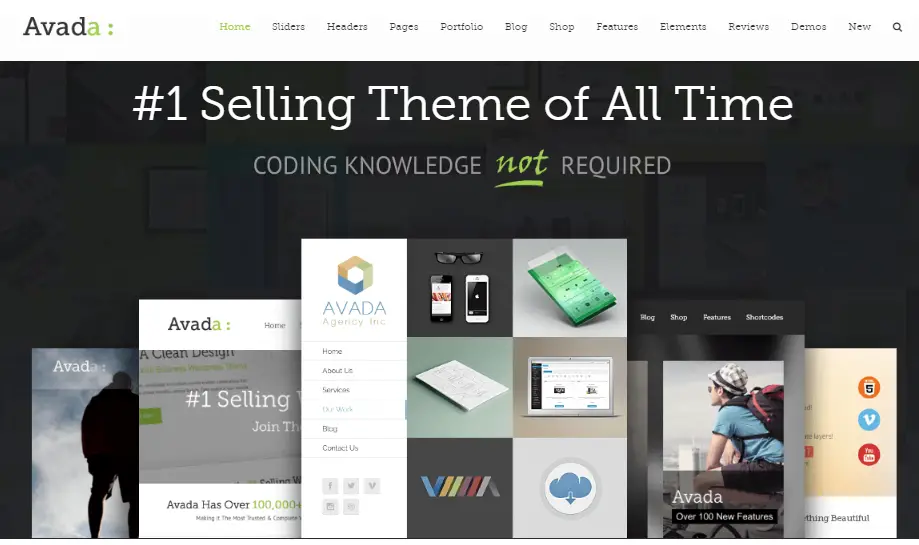
Avada is attractive mainly due to its flexibility. You can use it for almost any type of WordPress site by applying one of the many pre-built demo websites.
You’ll only need to add content and voila – you end up with a great-looking website. We have used this theme multiple times in our client work with amazing results and the client has always come out satisfied.
The Envato marketplace is extremely competitive, so being the bestselling item there means something. It has to be really great.
Similar to its competitor, ThemeFusion's templates also allow you to create just about any type of website.
You get access to an extensive library of pre-built demo websites, which you can apply to your own site in minutes.
If you don’t like the demo sites, you can always start from scratch.
These are the main features you can use:
- Great menus: several locations, mega menu with widgets, high level of customization and typography control
- Built-in drag and drop page builder
- Plethora of theme and page options
- 120+ design elements
- One-click demo importer
- Translation options
- Control over the site’s width
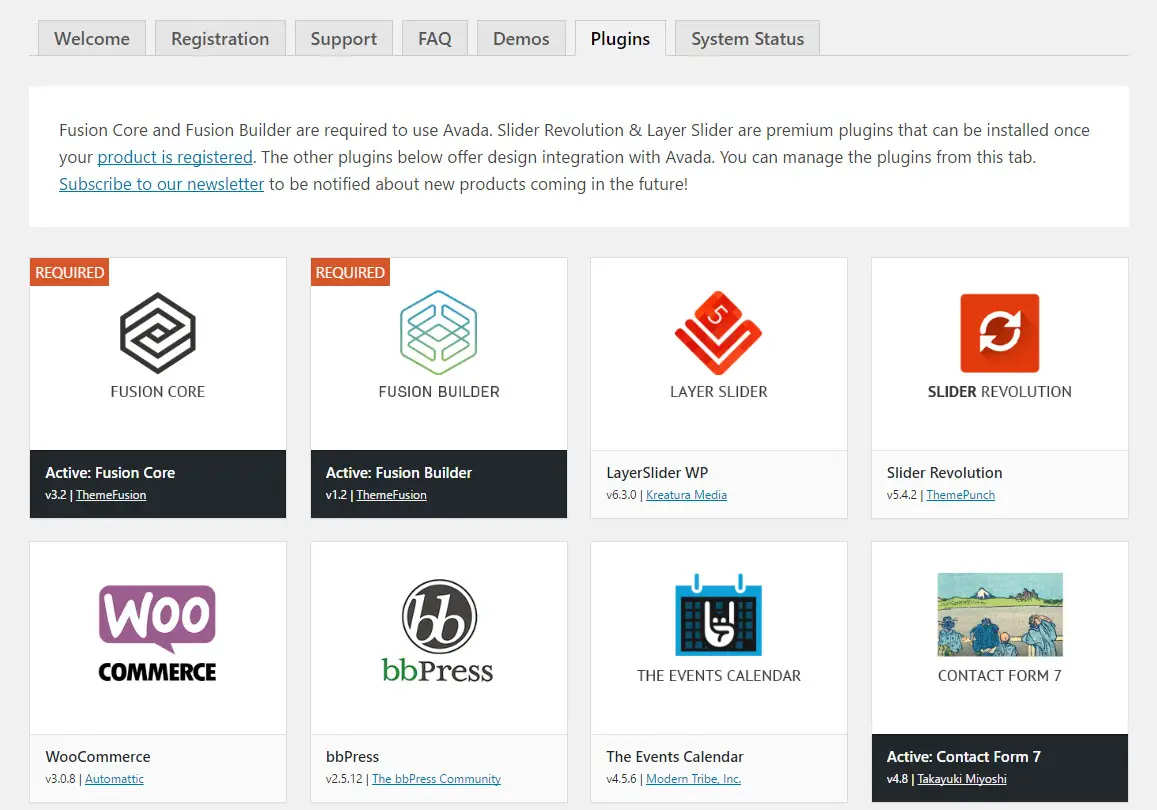
When you have installed and activated Avada in the themes page, you are then taken to a welcome area.
This is essentially a getting started guide to make sure you've done all the essential stuff.
You will be prompted to install any dependency WordPress plugins and set everything up.
Those dependencies will come in handy to set up specific features and functions. They include Avada LayerSlider, Slider Revolution, WooCommerce, bbPress, The Events Calendar, and Contact Form 7.
To be honest, we have found that Avada works at it's best when it's kept at a minimum number of plugins, so our word of advice is to keep the plugins to the only once you actually need.
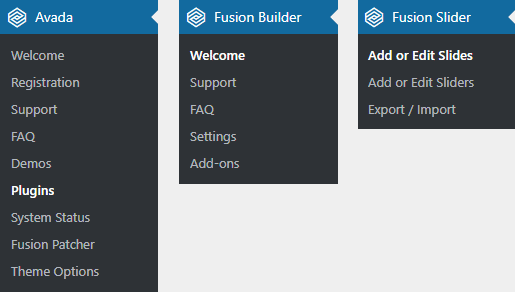
While Divi is minimally invasive with as few intrusions as possible, Avada takes a more forceful approach over your admin menu.
It shows itself by displaying menu items for Avada, the Live Visual Builder at the top of the menu. This means that it pushes the stuff you're used to such as posts, pages, comments, and plugins, further down the page
Through our trial and error, we found that that this isn’t ideal if you've been working with WordPress for a long time. You’ll find yourself second-guessing every time you select an option.
What's worse is that if you add the other recommended WordPress plugins, the menu will get even more crowded.
After using Avada for our project, we must say that this is something we really don't like about Avada.
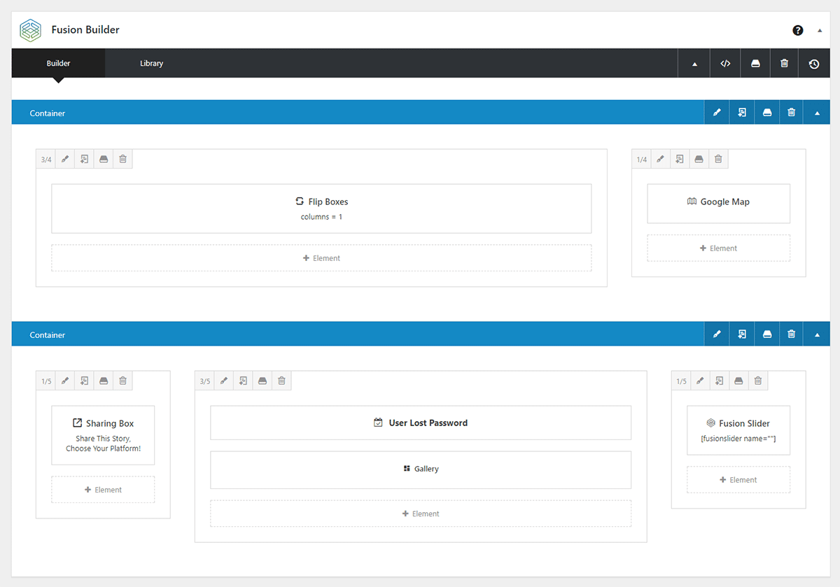
The Live Visual Builder is a front-end drag and drop page builder. This is a definite improvement over the old Fusion builder that we had struggled with before. It can be activated in your content whether they are posts, pages, or other post types, making it very accessible.
In contrast to Divi's colorful interface, the simple black, white, and blue color scheme of the builder feels a bit clinical.
It feels like it was designed by a coder, rather than a designer.
On the positive side, the builder is fast, functional, and very easy to navigate. On a blank page, you will see options to add a container (row) or a pre-made layout.
If you're only getting started with the builder, a guided tour video is also displayed.
While most users will not find the builder intimidating, we still recommend watching the video tutorial since it explains some things which you might be familiar with.
It covers the library system and shows you other settings and features which might leave you somewhat frustrated.

Once you start using the builder, you'll start enjoying working with it, because it has become so quick and fast compared to the previous versions which were a pain to use.
Having worked with a bunch of page builders, my biggest gripe is that some of them are ever so sluggish.
While the Divi Builder cannot be considered to be one of the slow builders, you'll still feel a difference between the two when you load them side-by-side.
Simply put, our experience working with Avada’s builder is now a fast and pleasant experience.
As would be expected, elements, are easily deleted, moved around, cloned, and configured.
Note that rows are known as "Containers". Elements can be dropped into columns which are placed inside containers.
As for all the elements you can infuse in an Avada-based site, below is an overview. As you can see, there’s an extensive choice of elements to add to your site.
The builder also allows you to see the changes you've made and lets you revert to those changes. It is somewhat different than the redo or undo button available with Divi - you need to use the timeline of changes to revert.
In fact, let's continue the Divi vs Avada review by now looking in detail at Divi's features.
Divi – Overview of Features
With Divi, you can build any kind of website and enjoy live responsive previews. It’s an exceptional product with great graphics. Although the powerful page builder meets the needs of any developer, it’s also suitable for people who can’t code.
We have used Divi for ages now, for several reasons. The theme has gone from strength to strength and the websites we've built with it are always top-notch.
The primary reason why Divi has kept improving is this.
Since Elegant Themes is getting most of their income from this item, they are continuously investing in it. What does this mean for its users? They are constantly getting new updates, which help them make improvements to their sites.
Divi version 3.0 brought real-time editing on the front page.
The Divi 4.0 version, brought another game-changing feature: the Divi theme builder.
With this, it's now possible to change the design, layout, and structure of your entire website. It allows you to use the responsive visual page builder to create custom headers, footers, and body templates for each type of page on your site.
You can create custom designs, layouts, and structures for various post types such as blog posts, products, portfolios, and others.
In addition to that, you can also do the same with custom index pages along with other special pages such as 404 pages, search results pages, archives, category feeds and more. You can literally customize the appearance of any part of your entire website now.
A website built with this is sleek, clean, elegant, and modern. It does give the impression of a lot of work invested in it. Still, the library of pre-built layouts and the simple page builder make this one of the most usable themes out there. The best thing about it is that it keeps getting better over time.
These are the most notable features we've used and based on our observations you'll find useful too are:
- In-line editing
- Customizable user interface
- Draggable widths
- Drag & Drop page builder
- Responsive editing
- Leads Split Testing Tool
- Theme builder
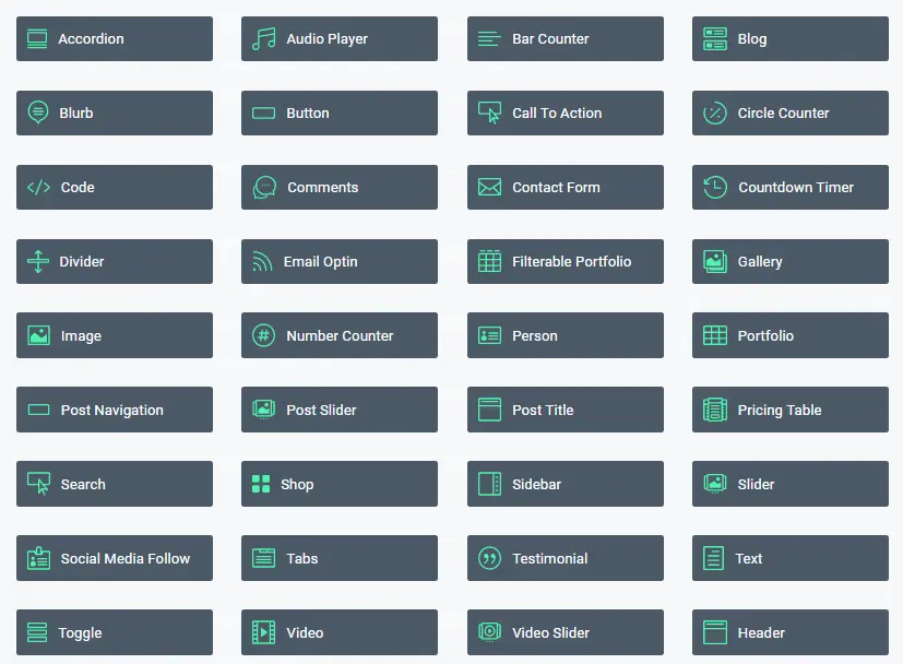
Let’s take a look at what you can do with Divi, so we’ll understand it a bit better:
Basically, you get every element you need for a detailed website.
We continue our Divi vs Avada comparison by checking what pre-made templates or demo sites are available on both themes.
Avada vs Divi - Available Templates
The number of templates you get with any theme is a measure of how much you can get out of it so we'll compare Divi vs Avada on their selection of templates now. We’re not all developers or graphically gifted so a high quality readymade template is essential.
Avada Templates
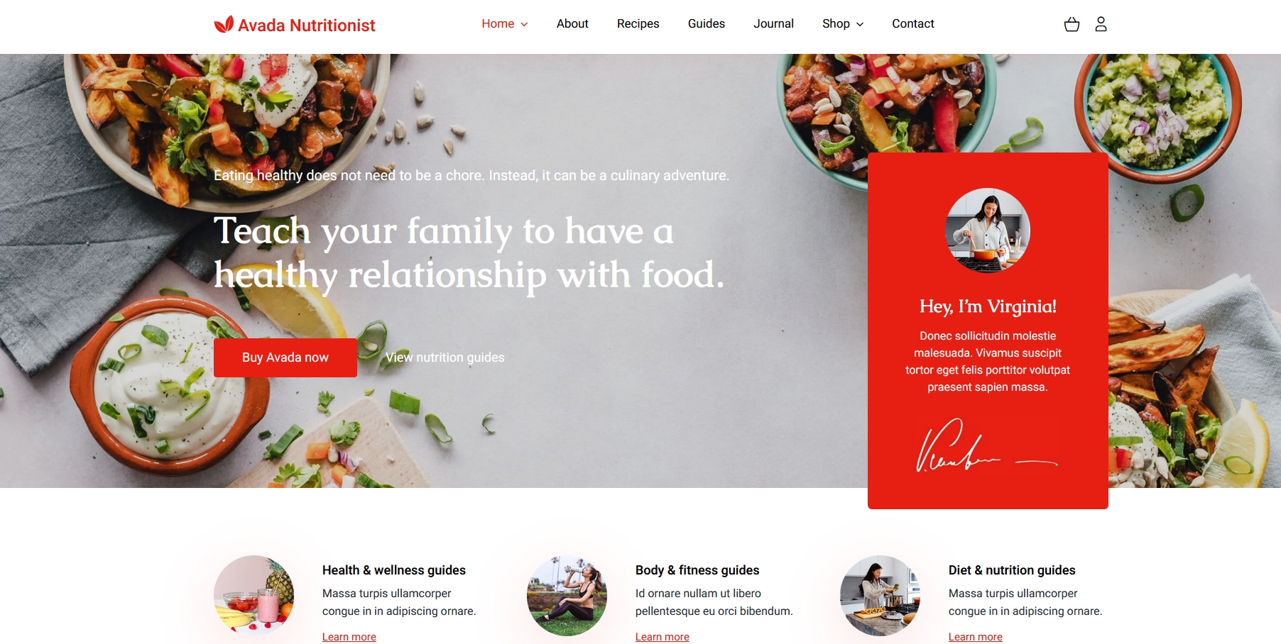
Avada ships with 91 prebuilt websites covering a wide range of industries. There’s a real mix of small business, eCommerce, agency and others. We've used several of these to get started and they really give you a head start in development.
Designs are modern, colorful and well balanced and offer lots of options for anyone who wants to use something already made.
There’s a very coherent style throughout all these templates. They are all thoughtful, balanced and creates a professional feel.
Avada Nutritionist is an example of a more colorful template.
Avada Extreme is another example of their eye for design.

Divi Templates
Divi doesn’t quantify how many templates it offers but there are literally thousands of pages of them. While developing our projects, the hard part is to actualy go through most of them, they are so plentiful. Like Avada, there’s a real mixture of genres and designs covering most needs.
Designs are either really coloful and lively or relatively flat and uninteresting (to my eyes anyway). While some are really good, some demos load very slowly and are quite uninspiring.
Definitely more of a mixed back than with Avada even though there are more of them.
Divi YMCA is a good little design that engages right away.

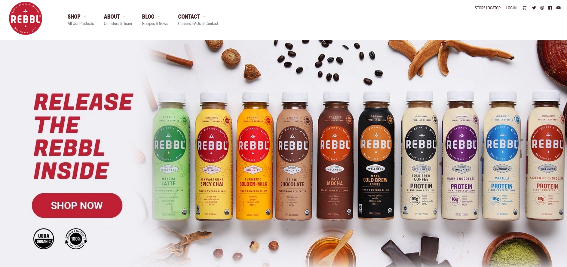
Divi Rebbl is an eCommerce template we would happily use ourselves.
Avada vs Divi Theme - Theme Building
Theme building is another core feature of these two themes. It’s all very well having readymade templates but what about if you want something unique? Let's see how the theme builders compare in Divi vs Avada.
Avada in Action: The builder
Due to the licensing, the installation of Avada includes an additional step when compared to the Elegant Themes theme.
You’ll need to validate your copy of the item before you get access to all plugins and extensions. The theme gives you an option to use it without such validation, but you’ll be missing cool features.
Similarly to its competitor, this template also lets you create a website from scratch.
However, it also gives you cool website demos (you’ll find lots of them) that are highly flexible, so you can still get a unique-looking website if you go for that option.
The demos include Product Page, Photography, Travel, Architecture, Lifestyle, and more. You can tweak any aspect of the site.
If you’re not the master of code, this template won’t give you any trouble for that. In fact, we have several designers who don't code, but they have achieved very good results nonetheless.
The page builder is a drag and drop tool that lets you create a website from scratch. It comes with a great choice of pre-built templates, which you can edit as you like.

You can adjust every page with additional settings related to the background, sidebars, footer, sliders, title bar, and more.
The good news is that this template makes website monetizing easy - you can simply use the Ads widget to bring ad banners to your site.
Where Avada Wins – Features that are missing in other templates
Remember how before we mentioned how the Elegant Themes template gave you a library of layouts (aka page templates) to apply to your pages and posts?
That’s great, and Avada gives you that option, too.
However, the template also lets you import an entire demo website in minutes. That’s where it wins.
Another important strength of this product is that it’s great at letting you take control of a mobile website’s appearance. You can exclude specific elements from appearing in the mobile version, and you can adjust the mobile breakpoints.
Aesthetics is a strong point of this template. Divi lets you create beautiful pages, too.
If we had to pick a winner in this aspect, Avada would be the one.
Visit the template demo on ThemeForest
Divi in Action : the Drag-and-Drop Builder
The Drag-and-Drop builder is where the Divi WordPress theme truly shines and is where we can see significant differences in Divi vs Avada. We have created many a custom WordPress site and it is as easy as it gets with this template.
Once you have uploaded and installed Divi on your site and activated it, you can just start working with it. You don't have to install any plugins at all (for example, Avada recommends you install specific plugins). It's still recommended that you perform any updates required and make sure you add your username and API key such that you get full access to the features and updates - directly via the admin area.
Elegant Themes have taken a minimalistic approach to how this integrates into your site. The builder is immediately available when you are editing contents, posts, and pages.
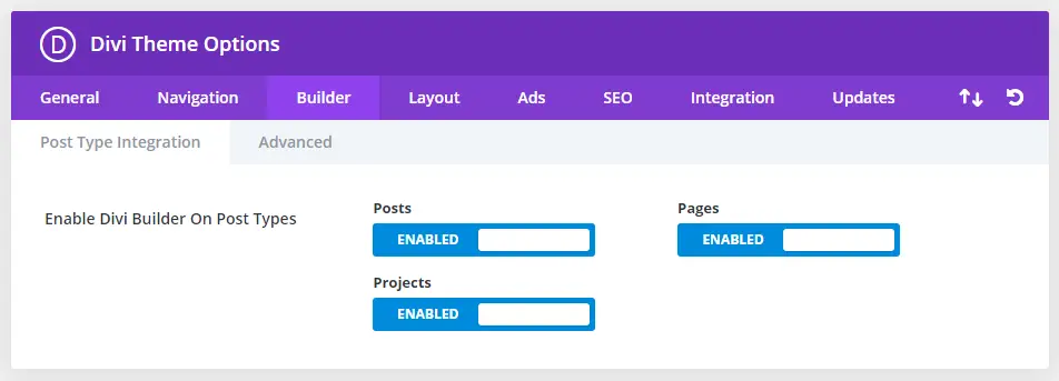
If you have additional custom post types, you may have to go to settings to enable Divi builder to work with them.
Divi builder works both on the back-end and the front-end editor. While some people prefer working in the front-end, others prefer the back-end - for example, myself, I prefer working in the back-end even of a front-end interface is available - for me it's more accessible with the rest of the options in WP. The front-end I could then use only when I need to tweak look and feel finely.
You might probably know that the page builder niche is very competitive right now, but, truth be told, the Builder from Elegant Themes is actually held as the level to aim for. The fact that it has a clean interface, a great user experience and is still fast - makes it a perfect combination. Even though the layout may look simple, that's clever User Experience design - it has many useful settings and features that you are not found in any other page builders.
Even at our agency, our yardstick when discussing page builders is Divi. We compare most of the other page builders to this one. Maybe because we've built up plenty of experience and expertise working with Divi, but even with new recruits, we find that they still find themselves getting up to scratch with Divi faster.
So how do you use it?
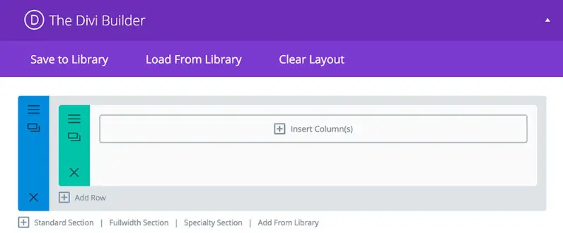
Once you click on “Use Divi Builder” button available in your post editor, and the Builder will come up. At this point, you can start editing by dragging and dropping content modules, columns, rows, and sections around as necessary for your site.
The theme also gives you the option to start from scratch by creating your layout.
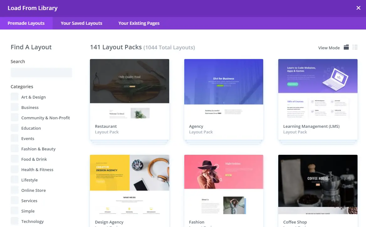
That means you’re choosing the hard way to build a site. However, it also gives you an extensive list of pre-made layouts, which you can adjust to meet the needs of your website. Before you start creating your own, we suggest checking out the layouts that are already available.
The template also gives you an extensive list of pre-made layouts, which you can adjust to meet the needs of your website. Before you start creating your own, we suggest checking out the layouts that are already available.
There are multiple layouts for you to choose from from at the moment and more are added over time, so you can create your own appealing page even if you don’t have advanced coding skills.
The layouts cover everything, from blog post templates and coming soon pages to multiple landing pages and homepage designs. You can start using several templates right after installing Divi, so this saves you a lot of time.
The templates save you from adding custom code while bringing versatility and good performance for your website.
We've used the templates over and over again to make sure that certain resuable aspects, such as promo widgets can be reused over and over again in the different part of the websites. That has saved us plenty of time and ensures we have consistency throughout our design.
As you are editing and either make a mistake or maybe you need to create a similar layout, you can either remove or cloned or copy sections at the click of a button. There are specific settings for each part, giving you a great level of control and detail over how everything is displayed.
In terms of the structure of how a page is constructed, content modules are displayed within columns. These columns are contained within rows which are in turn contained with sections. Of course, you have full flexibility to easily add standard sections, full-width sections, and particular sections that feature columns that span multiple rows.
You can then define how these are displayed on the various responsive sizes.
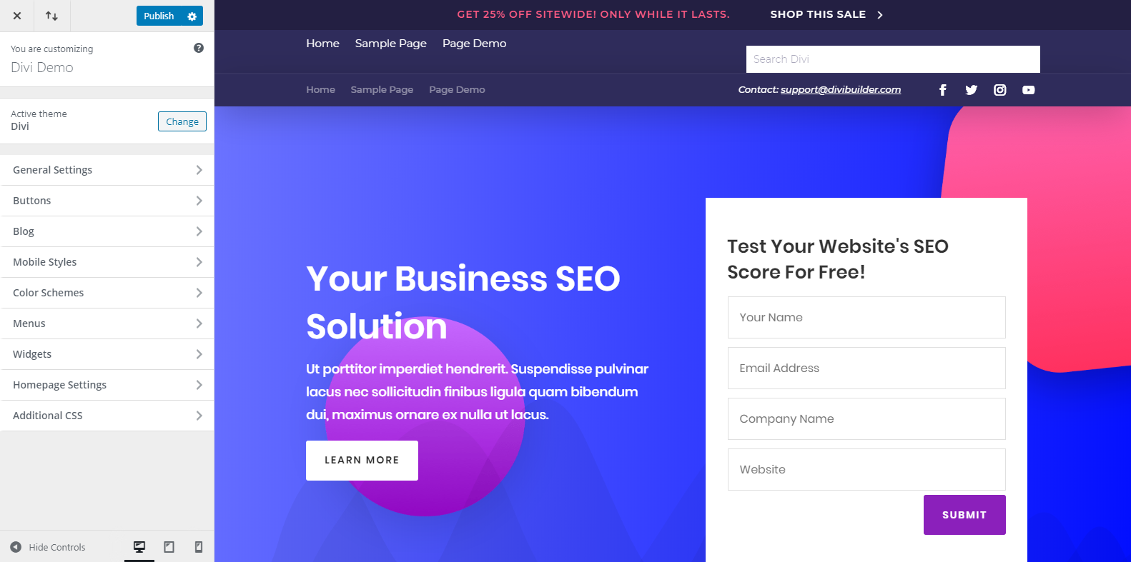
The Theme Customizer enables you to play with different elements of the page, such as the header and footer, buttons, typography, widgets, color schemes, and more. The good thing is that you get to experience the results of these changes in real-time.
That’s something that ThemeFusion's template doesn’t do for you.
Now, here's the kicker.
As a web designer or even more as a non-technical user, you are bound to make mistakes which might break your design. But the guys developing this have thought of this already. If you make a mistake in your layout, there is an undo button, redo button, and a history button that lets you go back to your previous design.
Surely a life-saver, and we've experienced this multiple times- truly a great feature.
Front-end vs Back-end editing
In the earlier versions of Divi, particularly before version 3.18, the front-end editor, also called "Visual Builder" is easily activated via the admin area by enabling it using the “Use Visual Builder” button. You can also enable it using the “Enable Visual Builder” toggle button in the admin bar on the front-end of your website (you need to be logged in to be able to do this).
Ever since WordPress 5.0 and the new Gutenberg editor, Divi’s backend editor no longer works, so when Divi 3.18 was release, Elegant Themes made significant improvements and changes in in the back-end editing features. However, more about that later on.
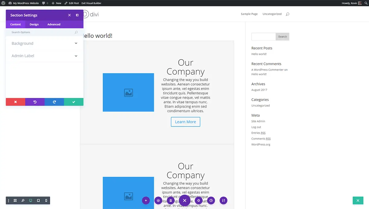
The Visual Builder uses a slightly different interface from the builder used in the backend or admin area. While it's not particularly hard to use, it is a bit more fiddly, and slightly less easy to move parts around, especially if you have a large and complex page.
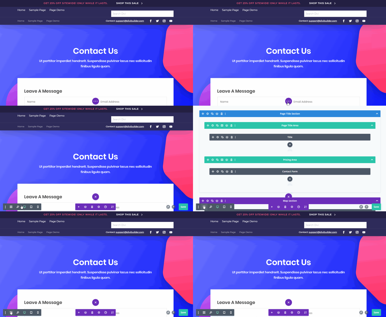
If you need to see more details, you'll need to click on the ellipses button (three dots) which brings up more options such as loading from the library, clear the current layout, and relevant page settings as necessary.
There is also a menu which loads at the bottom left-hand side of the page - this is especially helpful as you are working on your layout. The menu actually allows you to view your page the way it looks in mobile, tablet, and desktop mode, while the zoom out options will show you the whole layout.
The final thing we want to speak about in terms of the builder is the option called “Wireframe View”. This view actually hides your design and loads your layout as viewed in the default builder. This new feature allows you to seamlessly switch between wireframe (back-end) mode and visual editor with ease.
While it was originally a way for users to easily switch between the front-end and back-end builder, it has since become the new back-end editor, completely replacing the old one that works with the classic WordPress post editor.
Now that we’re talking about the back-end editor...let’s discuss that in detail.
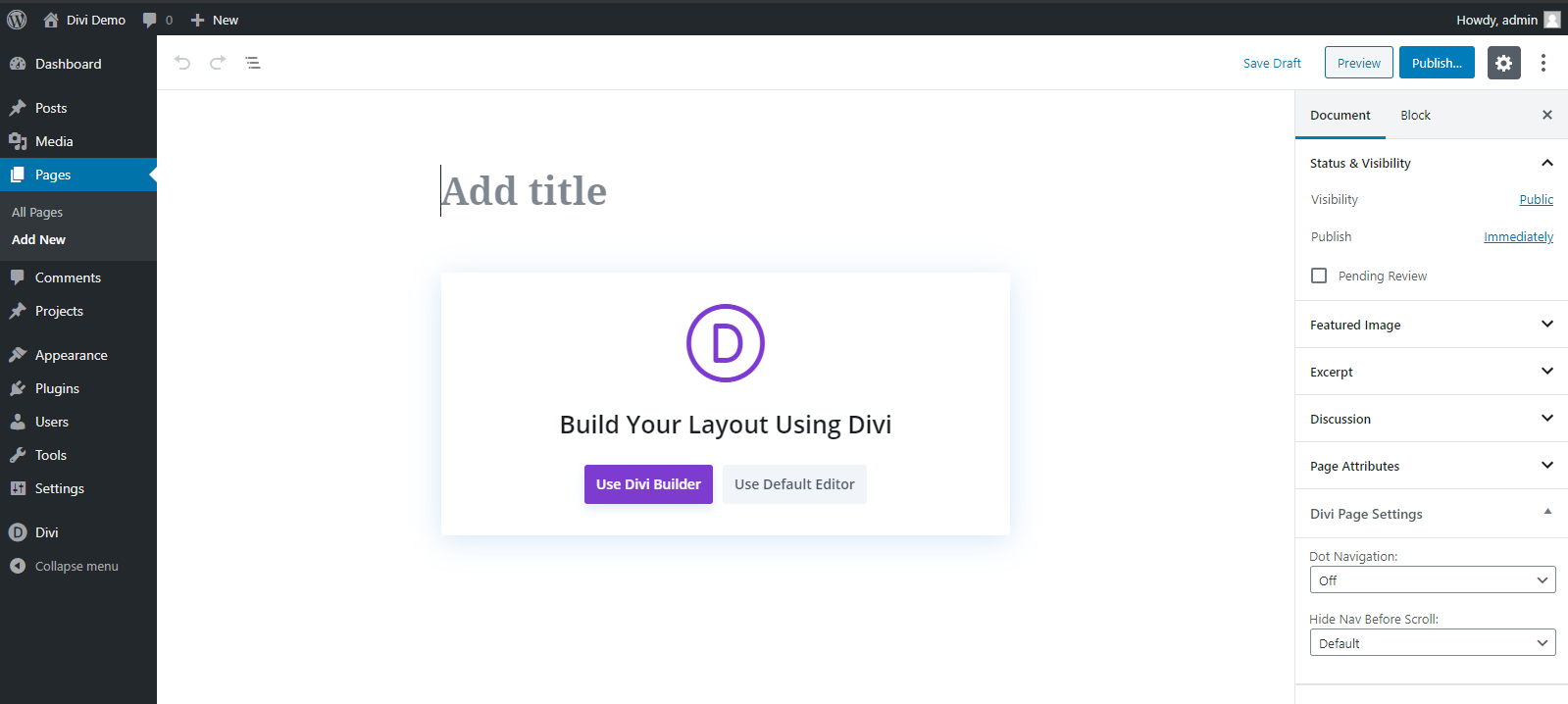
Since the release of WordPress 5.0 and Divi 3.18, the classic Divi back-end editor is now disabled by default. That’s because Gutenberg became WordPress’s new default post editor. The old Divi back-end editor was developed to work with the older “classic” post editor, so now it no longer fits the current scenario. So Elegant Themes released a new update and made it such that the Gutenberg editor now can use the visual page builder mode.
In fact, creating a new page in Gutenberg now shows the following screen:
Clicking the Use Divi Builder button immediately launches the visual builder with options to build a page from scratch, import an existing layout or clone a page.
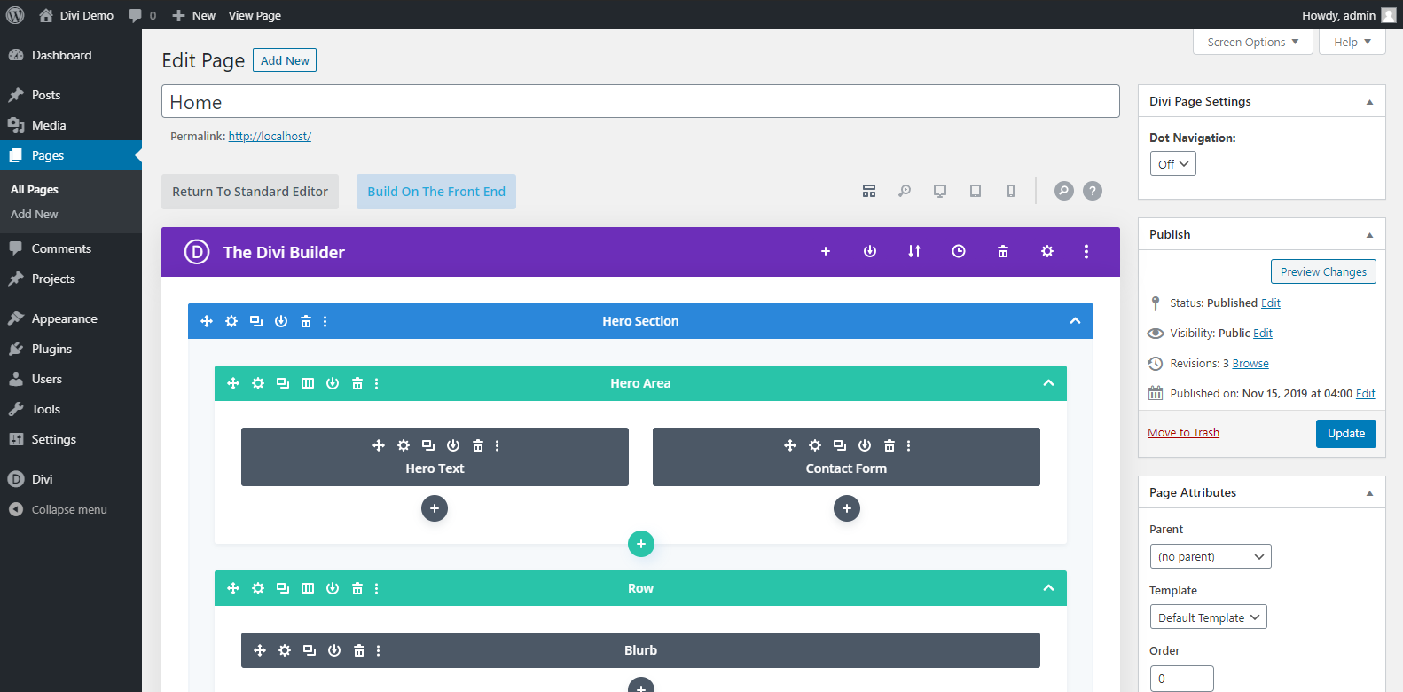
The new wireframe view essentially replaces the older back-end editor. It can easily be accessed with a simple click of a button when you’re in the visual builder mode.
Divi vs Avada - Backward Compatibility
Backwards compaitiblity is a minor feature but can be useful if a new update breaks your design or if you want to revert back to using the classic WordPress editor.
Avada Backwards Compatibility
AS far as we could tell, Avada works well enough with the WordPress block editor for building posts and pages. We created several blog posts using an Avada demo site and the block editor and they looked and worked well.
The overall design took on the Avada styling, while we could add content and images using the block editor.
Avada also says it can be rolled back to previous versions but we didn't try that.
Divi Backwards Compatibility
For those who still find themselves comfortable using the classic WordPress block editor, Divi has an option that allows you to revert to it.
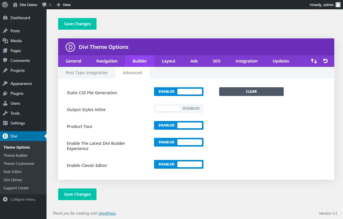
By going to Divi > Builder > Advanced, you can enable the Classic editor, which is WordPress’s original post editor.
There’s no need for you to use an external standalone WordPress plugin to enable this!
While it might seem like a simple feature, it’s a great way to ensure backwards compatibility for those users who are still comfortable with the previous user experience and way of working
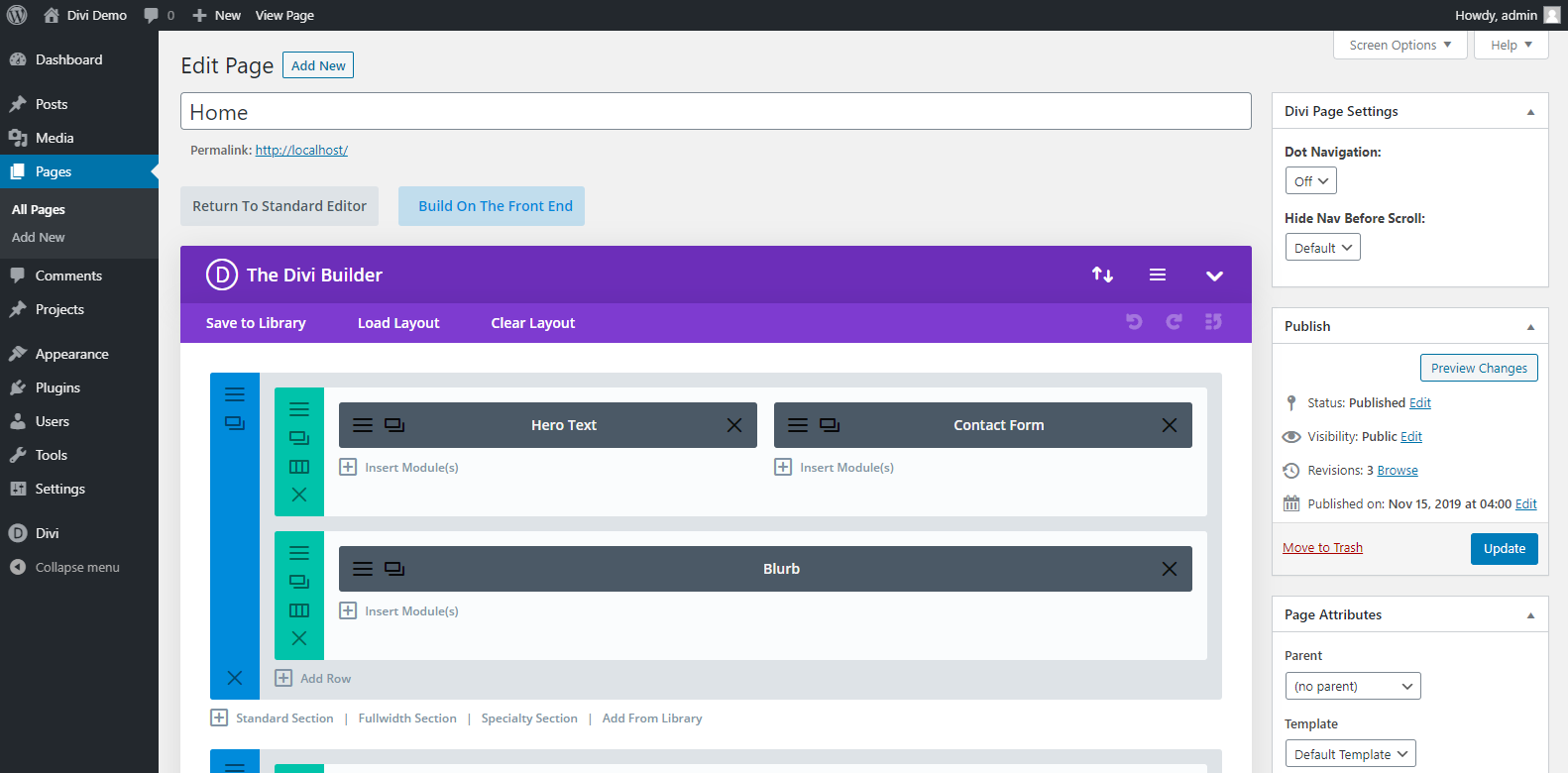
If you enable this option, you will be able to have the full back-end Divi builder experience again. If you’re on Gutenberg, this would have not been possible.
The old back-end uses the new wireframe view, but you can still go further back and experience the true classic Divi backend experience.
Going to Divi > Builder > Advanced, there’s the “Enable The Latest Divi Experience” option. If you really love the classic Divi backend editor, you’re going to want this option set to disabled.
Pretty neat! Particularly for those who are happy to work in the ways they are used to.
The above is the same page we saw earlier, only this time it's using the classic editor and the classic Divi back-end editor.
You’re missing some of the latest features this way. However, but if you click on the Build On The Front End button, you’ll be able to use the newer wireframe mode.
Divi also works well enough with the WordPress block editor so we could create posts and pages with both UIs.
Get 10% OFF on Divi until April 2026
Divi Theme Builder
Divi comes with a great feature: the Theme Builder.
Back in its earlier versions, Divi had some limitations in terms of customization. While it does come with a great customizer and powerful page builder, something was still missing: the ability to create custom header, footer, and body templates.
This specific feature is what has allowed us to create full custom websites from scratch with no limitations.
Read More: Divi vs Elementor - Which Pagebuilder is most worth the money?
With the new version, you can now customize virtually any part of your website. Elegant Themes took the power of the page builder and extended it to the entire website.
While the possibilities of using custom headers and footers are quite obvious, not the same can be said for custom body templates.
Usage and use-cases of these can be a bit vague for an inexperienced user. But for an agency like ours, where our clients come with plenty of different demands and specifications, the possibility of being fully flexible and the Divi theme builder gave us this possibility.
Simply put, with custom body templates you can make a custom design that alters the layout, structure, and design of your posts, pages, products, category feeds and more.
For example, by default, a blog post has its title at the beginning. When we are using the new theme builder, we can make it so that the title appears right after the featured image, or before, whatever you prefer.
We can also set what font, color, and size the text should appear, add custom elements to all the blog posts at once and more!
The beauty is that we can use the various Divi modules in whatever way we want. For example, take the Divi module for social sharing icons.
By using the theme builder, we can create a custom body template for blog posts that has the social sharing module, say, underneath the title.
Once you save it, all posts have social sharing icons, without having to install an external plugin for that!
The possibilities of design and use are now only bound by your creativity.
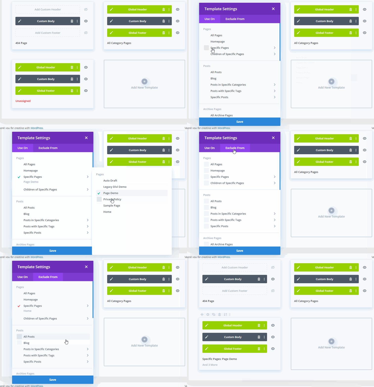
But what if you want to exclude certain posts from having a social sharing icon? Or what if you don’t want certain posts have the custom template?
The theme builder also allows you to include or exclude parts of your website from a template.
We can say that, literally, your imagination is the limit with Divi 4.0. After working with this product since it came out, we can't understand how we actually used to work without it!
Where Divi Wins – Features that Are Missing in other themes
The Leads split testing tool makes it easy for you to create multiple versions of a page and see which one works best in action. Split testing is a crucial part of every website’s development, and you won’t need to pay for an additional service if you use this template.
The real-time aspect is its strongest advantage. You’ll see every change you make in real-time, simply because the theme gives you a front-end editing option.
You won't find such features in other page builders, such as Visual Composer (at least not so far).
Another great advantage of this theme is that you can apply it to multiple sites without additional charges. How cool is that?
To add to the goodness, a recent update to Divi in August 2021 means faster page load times and seriously impressive performance. By using clever CSS tricks, the developers have shrunk CSS by 94%, removed render-blocking CSS, removed all duplication within files and tweaked it so only the CSS required for the page is used.
All conspire to make Divi faster than ever!
Divi is great, no wonder it's one of the best-selling WordPress themes of all time!

Avada in Action: The Fusion Builder
Due to the licensing, the installation of Avada includes an additional step when compared to the Elegant Themes theme: you’ll need to validate your copy of the item before you get access to all plugins and extensions. The theme gives you an option to use it without such validation, but you’ll be missing cool features.
Similarly to its competitor, this template also lets you create a website from scratch. However, it also gives you cool website demos (you’ll find over 90 of them) that are highly flexible, so you can still get a unique-looking website if you go for that option. The demos include Product Page, Photography, Travel, Architecture, Lifestyle, and more. You can tweak any aspect of the site.
The Fusion Builder is a drag-and-drop tool that lets you create a website from scratch. It comes with a great choice of pre-built templates, which you can edit as you like.

You can adjust every page with additional settings related to the background, sidebars, footer, sliders, title bar, and more. The good news is that this template makes website monetizing easy - you can simply use the Ads widget to bring ad banners to your site.
Avada vs Divi - Ease of Use: How Quickly Can You Create a Website?
When it comes to speaking about Divi vs Avada, ease of use is the biggest advantage of multi-purpose templates. Both templates let you create a website based on layouts or page templates. The learning curve to both of them is gentle. However, they are not just "skins" and require getting used to.
It’s serious software we’re talking about. If you want to get the full advantages of both these products, you’ll need to play around. To build up expertise, some of our designers have to spend a good few hours playing our with pet projects.
While ThemeFusion has an extensive knowledge base and cool video tutorials that make your job really easy. Whatever feature you want to use, you can easily learn how to do it. Divi’s guidelines are more organized and easier to read for casual users. You’ll also get hands-on video tutorials for each entry you want to implement.
There is no pure winner in this battle: the learning curve is pretty much equal with both these items. They are relatively easy to use for people without advanced coding skills.
Testimonials from Users
Besides our ow projects, tests and full review. It’s important to see what real users have to say about Divi vs Avada, so you’ll base your decision on other people’s experience too. Both sites feature testimonials by users. Here is a glimpse:
Andrew Palmer from SomebodysHero.co.uk is impressed by Elegant Themes:
“After discovering Elegant Themes some 4 years ago and using pretty much all of the templates on my client sites – it is clear to say that my business is built on Elegant Themes. Around 7 months ago, I discovered this theme and used my friend and client Pat Sharp as a test on Divi. Since then, I have transitioned around 40% of my clients to it and continue to beat the drum on the theme - its flexibility allows me and my developers to build a site in a few days rather than a few weeks and it offers everything a customer could need, out of the box mobile ready and if we do need to make amendments to the CSS to change the way it looks we can!”
There are plenty of reviews on ThemeFusion's site, too. Here is what one of the users says: “You guys have top-notch customer service and an amazing product. Such a great template with unparalleled support. Can’t thank you enough for all the support you have offered a newb like me getting the web page up. You’ve saved me literally thousands of dollars.”
As for independent reviews, Quora is a nice source of them.
This is what Sanjeev Mishra, a WordPress expert, says about Divi:
“This WordPress Theme is by far the best theme from Elegant Themes Club and somewhere I read that the number of sales happened because Divi is more than all other Elegant Themes’ themes combined… Using it, you can build a nice layout for your site and add amazingly beautiful elements. No doubt, there are better-looking items available on the TF marketplace or even some better themes are available on other clubs.”
Here is what Karol Krol, author of WordPress Complete, has to say about Avada, in comparison to Divi:
“Avada gives you much more in terms of customizability. It has a huge options panel where you can adjust basically anything about your website - things like layout, the styles, logos, headers, the behavior of things, etc… If you want the highest available number of options and tune-ups, go with Avada. If you want to design with drag-and-drop and see everything in real-time, go with Divi.”
The Looks: What You Can Achieve with these themes
We picked three great websites built with each of these items, so you can see how they look in practice. From the examples below, you’ll see that both allow you to build professionally-looking websites with tons of flexibility. ThemeFusion's creation may win the beauty contest, but it’s close.
Websites built with Divi (Examples)
FashionOrFamine.com
The first site is a fancy looking site about fashion - see what a great example of the template in action looks like.
FindabilitySciences.com
This is more of a corporate website - and you can see the site oozes professionalism.
HowToBeast.com
And now for a completely different example of a site using this template, which still manages to shine. We can't say that it is not flexible.
Now that we've seen some sites built with ElegantTheme's product, let's see how sites built using ThemeFusion's template compare.
Sites built with Avada - Examples
Liberty-Trails.com
Making use of stunning photography, The template takes this site to great heights.
Maui.Hawaii.edu
Simple, but professional, just what a university website would need and what the template has given this site.
YellowMarineConsultancy.com
A bit of a more wordy site, the Themefusion template still creates an excellent result
Avada vs Divi Pricing
The crucial aspect when it comes to Divi vs Avada is probably pricing. Through our own usage of both of these themes, we can tell you right off the bit that the Divi is better value.
And we'll explain to you how we've lived this value at our agency.
Divi comes into two pricing options: $89 per year for Developer, and $249 for Lifetime Access. (and you get 10% OFF if you use our discount)
Get Divi Now at 10% OFF until April 2026
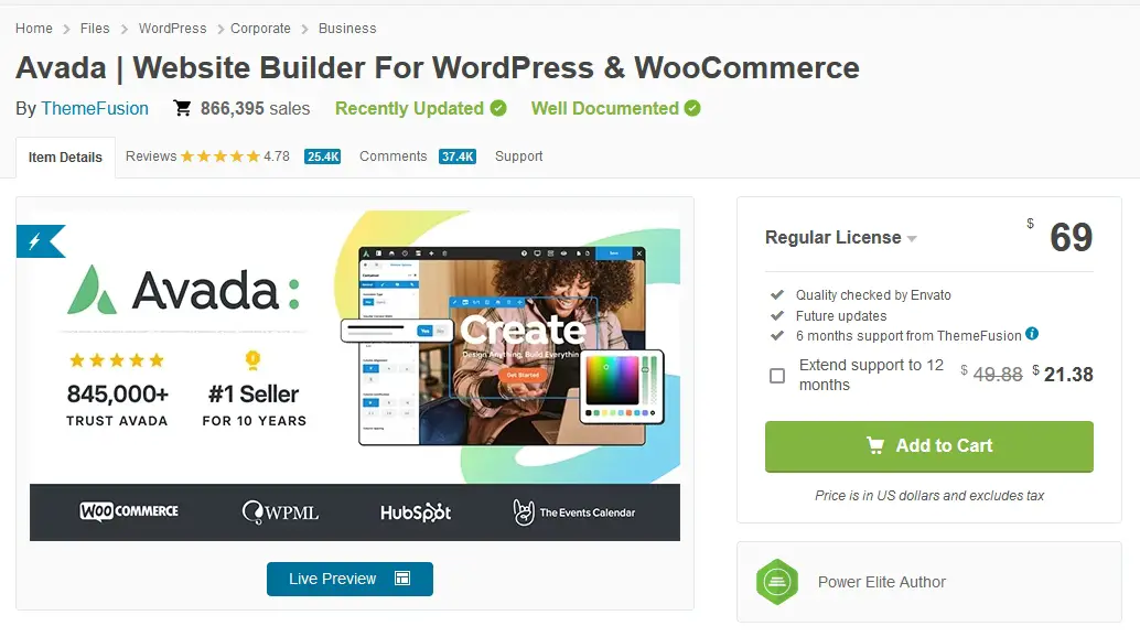
A Regular Licence for Avada costs $69 ($91 if you want extended support to 12 months).
The question is: which one offers most value for your money?
An annual Elegant Themes membership will cost you $89 per year.
With this, you get to use it on an unlimited number of sites and you get access to all the products from ElegantThemes and that includes the Divi Builder plugin, which lets you take its power to third party themes.
The Regular License for ThemeFusion's template costs $69, and it’s a one-time fee. You get to use it on a single site. With this package, you get 6 months of support and lifetime updates.
An Extended License for the template comes with a one-time fee of $2950. It gives you 6 months of support and lifetime updates.
There’s no clear winner regarding the price tag if you are developing a single website only. The packages are different, so you’ll choose the best value for your needs.
If you need a theme for a single site and you want lifetime updates, Avada would be the better option.
BUT
If you want to use your purchase on multiple sites, then go for Divi. The moment you need to build more than website, e.g. you are a web designer or an agency, then immediately Divi makes more sense because you can keep using the same Elegant Theme membership over and over for as many sites as you want.
Our agency has bought Divi years ago with a lifetime membership and we're still churning out several websites every month based on the latest version of this premium theme.
Has Divi paid for itself? Several times over.
Is Avada expensive? Compared to the cost of a full website now, but in principle, the better ROI we got from using Divi makes it a no-brainer.
This is an absolute win in terms of value and Divi takes the edge here.
New Features From Divi
For the last few months, the Divi team has been very hard at work and have created a number of new products for the Divi family. Amongst the new products and services offers we now have added to our tool set:
- The Divi marketplace - a market place for Divi plugins and extensions developed by 3rd parties
- Divi Cloud - cloud storage for web designers
- Divi teams - collaboration for Divi agencies
- Divi hosting - complete cloud hosting for Divi websites
Check out the Elegant Themes website for each of these new offers and get our discount below.
Get 10% OFF until April 2026 Only
Avada Theme Review
Although we've highlighted quite a few aspects of this theme in this article, we've also made sure that we write a complete, unbiased and detailed review of Avada here. Really and truly, if you are writing a comparison between two popular items, you have to focus on the comparisons and the differences rather than the highlights of the specific theme.
This is why we've opted for writing a specific review for ThemeFusion's best-selling item.
In that article, we concentrate specifically on the strong points and problems with using this theme. You'll learn about its own Page builder and all of the other features and benefits which make this theme such a success.
Divi Theme Review
This comparison with these two giants of the WordPress industry wouldn't be complete if we didn't mention that we've also written a highly detailed review of Divi - after using it for several of our projects. Truth be told, as we've also said in this article, you're probably not going to get fired for choosing either of these templates to use on your website.
In the full article and review, we dive deeply into the features of ElegantTheme's most-popular template and see what are the great things about it, and what could do with some improvements.
We don't beat about the bush, we call a spade a spade, but that's why you trust us right? Because we write the true experience we've had as an actual user of both these themes.
That concludes our Divi vs Avada comparison, but let's check out some FAQs.
Divi vs Avada Frequently Asked Questions
Which is better Divi or Avada?
Divi is better than Avada in our opinion, because in terms of value for money, a one-off lifetime Elegant Themes membership can be used for unlimited sites giving you great ROI. Avada is still a good theme, and one of the top-selling themes of all time. Both of these themes are solid choices.
Which is best Divi or Astra?
When it comes to comparing Divi to Astra, we do believe that Divi has the edge when it comes to pricing, but Astra has the advantage when it comes to speed. You will need to make the choice based on whether you want the best lifetime value in terms of money, or the best speed for your website. Both themes are solid choices.
Is Divi the best WordPress theme?
Yes, Divi is the best WordPress theme in many aspects, although this is a subjective choice. As a WordPress theme that has been around for years and always developing and improving, Divi has kept abrest with WordPress user needs. Moreover, it comes with very good lifetime pricing, making the obvious choice for web designers or agencies that have multiple clients, because it returns a great ROI.
Divi vs Avada Bottom Line: What Theme Should You Choose?
In terms of aesthetics, both templates are quite fancy. When it comes to usability, there’s no clear winner there. As for the price - you pick what gives you most value, depending on the needs you have. So when it comes to comparing Divi vs Avada - we're really down to the wire.
So which is the better multi-purpose WordPress theme: Avada or Divi? The clearest answer we can give you is: it depends.
If you want to build multiple sites and you want to see the changes you make in real-time, and have the ability to customize the header, footer and body layout then go for Divi. If you don’t care about front-end editing, you want to get more customization options, and you only need a theme for a single site, then Avada is the better option for you.
And if you plan to build several websites, then Divi gives you the better long-term investment.
So which one will you choose?


