Dark website design and black websites have always been a very controversial topic of discussion. Many web designers believe in pushing boundaries, and are happy to adopt the concept of black web design and launch black websites. Others are still not in favour of using it in their designs. This is mostly based on concerns over dark design and readability or brand fit.
Done properly, web design using dark colours can convey a very creative, elegant and professional look and feel to users. That said, creating a dark website design is quite a challenging job that requires the web designer to be an expert in web usability to get it right.
This article focuses mainly on different scenarios when you may use dark or black web design. We will also cover some things to keep in mind while working on a dark-themed website.
{autotoc}
35 Fantastic Examples of Black Websites
Here are a few amazing examples we promised.
We have collated some of what we think are the finest examples of black websites around right now. They all exhibit the qualities we have discussed so far and showcase the brand, product or service at their best.
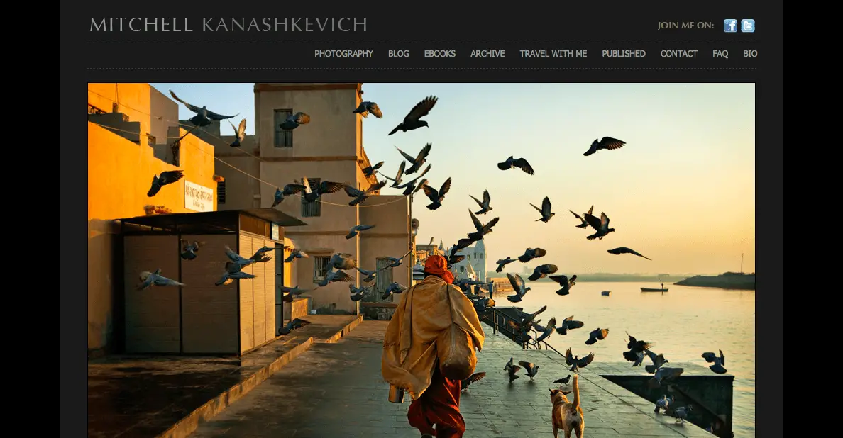
1. Mitchell Kanashkevich
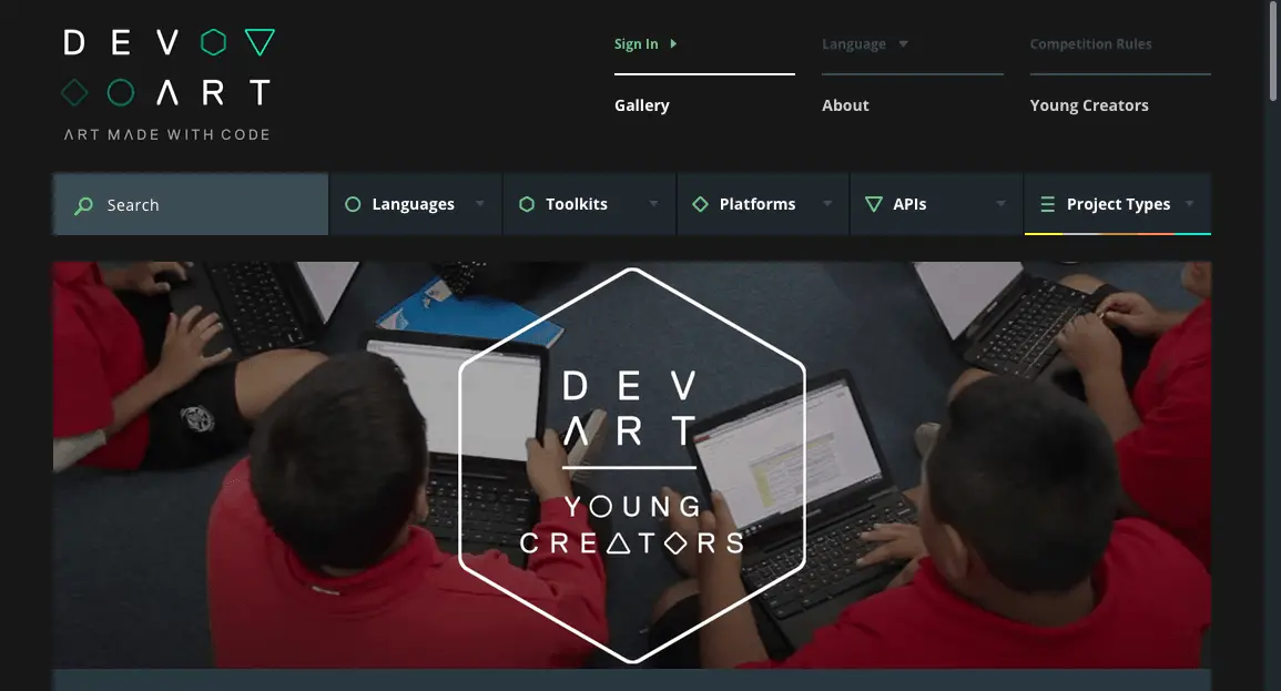
2. Dev art
3. Jack Daniels
One advantage of black websites is that it instantly gives a premium feel which can work with certain products. Jack Daniels is one of those products. The dark design suits the brand perfectly and good balance of font choice and colour, empty space on the page and well-designed visuals makes this work.
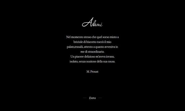
4. Pasticceria Adami
Pasticceria Adami is an Italian website promoting a bakery in Verona. It makes excellent use of a dark background with sparing use of images, fonts and page elements. It’s a simple but very effective black website design.
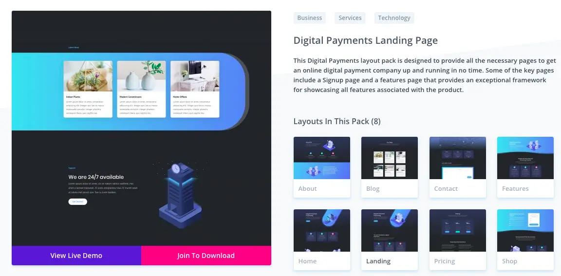
5. Divi with Digital Payments Template
Divi, the ever-popular product from ElegantThemes is a great option for several reasons. It is a popular, mature, versatile theme that you can customize into any kind of niche you want, so as a designer, this should be one of your go-to options.
You can use the built-in layouts to create a wide range of designs. For example, you can see the layout which uses bright colours and darker background to make the elements pop. An excellent look if you want to stand out from the crowd!
Click here to get 10% OFF Divi with Dark Layouts until May 2026
6. Astra - Responsive eCommerce Theme
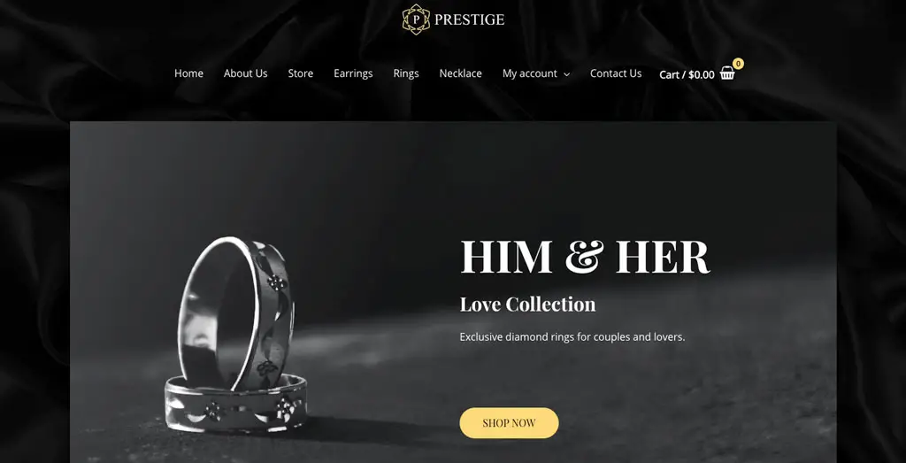
The following Jewellery site, a Starter Site by Astra of a Jewellery site is a great example of black websites design that combines attractive visuals with great font choice. It’s a simple install that includes most elements a new online store is likely to need to begin trading.
Of course, such a theme can be used for many other eCommerce shops that need to focus on their luxurious product.
Check out Astra Starter Sites for the Prestige Black Website
7. Rhapsody - WordPress Multi-purpose theme
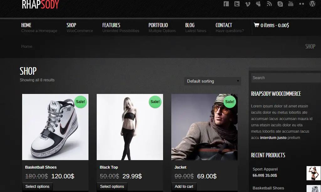
Rhapsody is a fashion-oriented black website design that delivers great use of page space with high-quality images and visuals. It integrates with WooCommerce so rather than looking at someone else’s eCommerce store, you could build your own!
8.KingGym - Fitness, Gym and Sport Magento theme
The KingGym Responsive Magento Template is a great solution for sportswear, sports accessories and shoes online shop. The impressive design brings visitors a powerful, dynamic and strong feeling at first sight.
Given that Magento is typically a fairly complex system you might want to read this Collectiveray article on how to hire a Magento developer or freelancer.
Learn More about KingGym Magento Theme
9. Kallyas - Responsive Multipurpose WordPress Theme
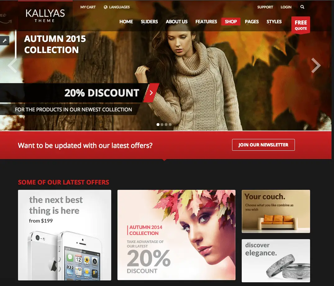
Kallyas is one of the most advanced themes you can get today that uses dark design. It comes with its own page builder, includes most of the tools you’ll need to begin trading and works with multiple plugins and addons.
10. HotDot
11. OregonGridiron
12. Velthy
13. Parallax Pro from Genesis StudioPress
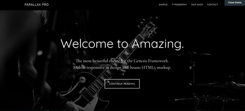
StudioPress, a WordPress theme vendor behind the incredibly successful Genesis framework have used their Parallax Pro theme to create an excellent black website design, as you can see below.
14. Neve with Photographer Starter Site
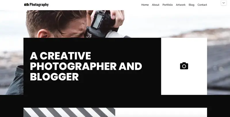
Neve from ThemeIsle is another WordPress theme with endless possibilities, but the Photographer starter sites takes it down the black minimalism path. Check it out in the demo below.
See Live Demo and get 10% OFF until May 2026 only (CollectiveRay exclusive)
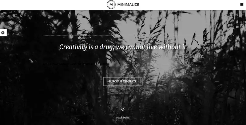
15. Minimalize - Single page multipurpose WordPress theme
The Minimalize WordPress theme is a great example of taking minimalism, combined with a black design to achieve a fantastic result. Check out the demo below to see how great this looks.
16. Rhythm HTML Template
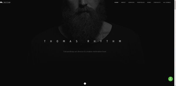
If you're looking for an HTML template upon which you can build, this Awwward winning template is a great choice.
17. Nerisson
18. Kaber Tech
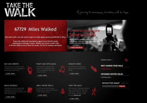
19. Take the Walk
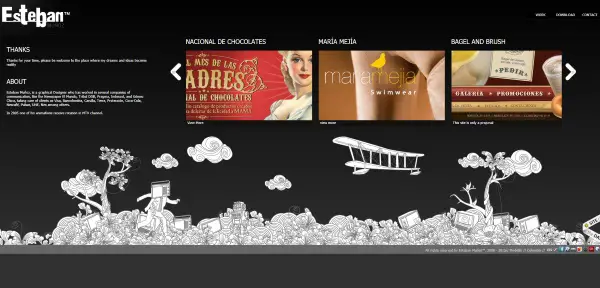
20. Esteban Munoz
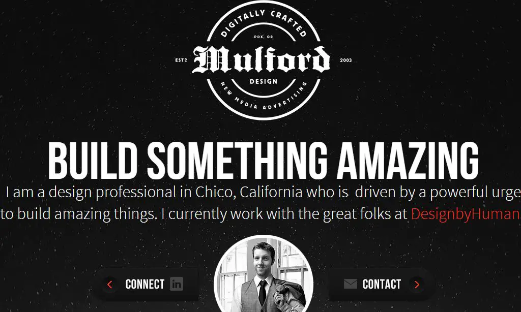
21. Ryan Mulford
22. Vitamin Talent Agency

23. Book of Beards
24. Vool
25. Umar Sheikh
26. BlackBerry

27. Lamborghini

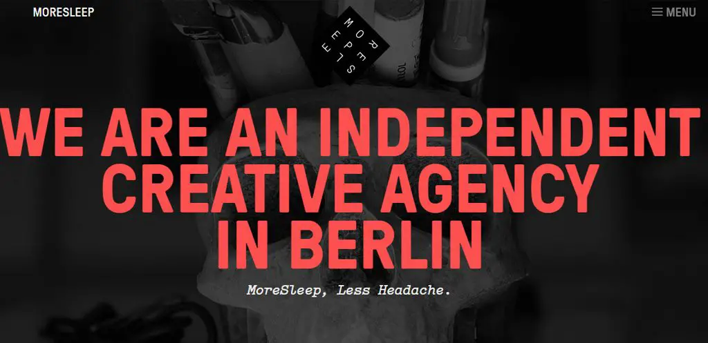
28. MoreSleep
29. The Creature Technology

30. EXO - Creative & Corporate-specific Purpose Theme
If there is one type of company that can pull off a dark website design, then it's a creative agency. Check out EXO, a theme designed for creative agencies and corporate sites.
31. Metal - Mobile-friendly Building & Construction Business Template
But you don't have to be either creative or a corporation. Even regular businesses including self-employed services-based businesses, or other regular businesses can use a site with a darker look and feel.
Metal is an excellent example of this usage.
Click here to learn more about Metal
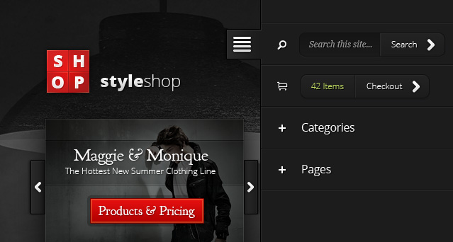
32. StyleShop
This is a great theme, based on a dark background, allowing the products you'd want to sell to pop. StyleShop is a powerful eCommerce theme that has all the required tools you need to launch a successful online store.
The design is both beautiful and responsive, it includes a unique mobile layout that makes browsing your website a breeze no matter what size of device you are using!
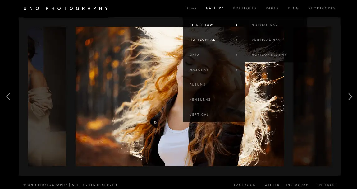
33. Uno - Creative Photography WordPress Theme
Uno has a black website and a light website and both work well. It is a well-designed theme with clean code, Retina Display support, multiple page and layout options and a range of extra tools to create a superb portfolio website.
34. PhotoLux - Photography Portfolio WordPress theme - Photography Portfolio WordPress theme
Photolux is a powerful and elegant Portfolio and Photography WordPress Theme which is best suited for photographers and creatives who use portfolios to showcase their work.
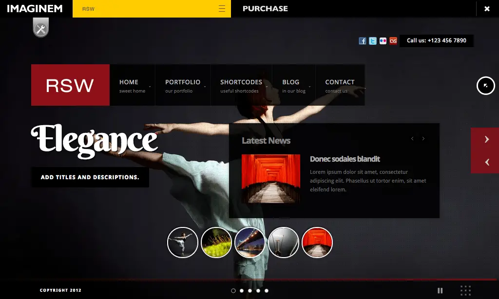
35. RSW - Responsive Full-Screen Studio for WordPress
RSW ( Responsive Fullscreen Studio for WordPress ) is a powerful theme for photographers and creative artists and comes with Light and Dark with theme options supporting multicolor customization of theme elements using color pickers.
IMH
Do you want a fast website?
Who am I kidding? Don't we all?
So why do so many of us struggle?
The biggest challenge is usually finding a fast, reliable hosting company.
We've all been through the nightmares - support take takes forever or doesn't resolve our problem always blaming something on your side...
But the biggest bummer is that the website always feels slow.
At CollectiveRay we host with InMotion hosting and our website is stupid fast. We run on a custom stack of LightSpeed server setup on MariaDB with a PHP7.4 engine and fronted through Cloudflare.
Combined with our front-end optimizations we reliably server 6000 users every single day, with peaks of 50+ simultaneous users.
Want to get a fast setup like ours? Transfer your site for free to InMotion hosting and get our 50% OFF on current pricing.
Try InMotion Hosting with 50% OFF for CollectiveRay visitors in May 2026 ONLY!
Black websites: A true sense of sobriety and seriousness
For those unfamiliar with black website design, it’s a unique design concept of using light lettering and graphics on a dark background. It’s a reversal of the traditional white background with dark font and can work exceptionally well for some brands and in some circumstances.
Websites designed with this concept predominantly use a black colour that gives a serious, sophisticated and classic look to the design. Unlike light design, which often keeps visitors busy clicking and scrolling, dark design draws the visitor’s attention to the most important parts of your website. The product or the service.
While the majority of websites incorporate light colour schemes in their design to deliver visitors an energetic and cheerful browsing experience, black colour schemes also can entice visitors to perform a desired action.
However, as compared to light designs that can be used in various contexts, dark designs are not suitable for all kinds of websites. If you use dark design in the wrong situation, it may make your website look ugly, gloomy and unprofessional.
You really need to make sure you are using this concept in the right situations!
When does it make sense to create black websites?
The concept of dark design doesn’t work in every situation. For example, black websites would not work where a brand simply does not fit, where the product is not suitable or where the audience would not respond positively to a dark design. Text-heavy pages are not ideal on black pages as it is more difficult for our eyes to read white text on black backgrounds rather than the other way around.
Here are some considerations when considering black website designs:
1. Make the text readable
To achieve readability on dark websites we highly recommend you increase the font size. Small fonts are easily readable on a light website but reading small light text on a dark background for a long period can strain the eyes. To overcome this, increase the font size until you find the text perfectly readable.
As a general rule, keep the font size 18px or above. Remember to test on different screen sizes for the widest appeal.
2. Analyze the brand
Consider what words describe your brand best and what kind of services, products or content you’re going to offer on your site. For example, if you’re going to create a web design portfolio, then a dark background could suit your needs better. If you’re running a tutorial website, a dark design might not work so well.
Premium brands work well with black websites, as do creative websites, portfolios, car sites and websites for high-end products.
3. Pick the right fonts
Font choice plays a vital role in any design and must be given close attention while working with black websites. Whatever fonts you have chosen to use in your dark layout, double-check their suitability on all screen sizes and with different sets of eyes. Usability testing is key with black websites and the more you test, the better the end result.
Font colour is also important.
A black background requires a light font in order to be readable. Contrast is key. Getting that right reduces eyestrain and increases readability.
4. Use more whitespace
Increasing whitespace is another great way to improve the readability on dark websites. The term whitespace refers to ‘empty’ space on a page and is a legacy of print media. Even though we are talking about black websites here, whitespace is still relevant.
The more white space you have, the more readable your text will be. This combines with word count on pages but is not the same thing. White space is as much about how you place content on the page as much as how much content you put on the page.
Consider adjusting kerning and leading in your text for sufficient white space. If you have a lot of content on your site, divide it into small paragraphs and pay particular attention to space around that content.
5. Exceptional quality images
All websites deserve high-quality images but black websites need more. As the design pulls the eye towards the imagery, that imagery has to be of a very high quality. It also has to be sharp, use good focus, have sufficient depth and interest and showcase the subject of the image at its best.
Black websites have a lower requirement for written content but a much higher quality demand for image content.
6. Use reflections in images
One of the advantages of a dark design is that it gives you the ability to place emphasis on key elements in your website. Though the same can be done in a light background, a dark background gives you more options like reflections and other image blending techniques. So, take advantage of them to give your dark design a classy and fascinating look!
7. Put as little content as possible
Last but certainly not least, put only essential content on a dark website. As mentioned already, white text on dark backgrounds impacts readability so care must be taken to balance this. You could combine a black web page with lighter text blocks or separating the design so you have a mostly black website with content-heavy pages reversed.
Does dark design really affect readability?
Many people complain that a dark design is not good in terms of usability and readability. They consider that reading light text on a dark background can strain the eyes which results in a much less enjoyable reading experience. There is no science to back this up but it is a widely held opinion that black websites are harder to read than white or light ones.
Problogger performed a survey back in 2009 on this very question and found 47% of web users preferred light backgrounds on blogs.
A dark page background and light font is not solely responsible for poor readability and it will not affect every visitor you have. However, it is common enough to require careful consideration if you are considering a black website design.
Readability is all about typography and the right use of elements on your site. A website with black pages can appeal to a wide audience if you choose suitable fonts, use the right font size and colour and pay some attention to white space and line-height.
You will need to carefully consider every page element to achieve the aesthetic elegance in your dark design.
What types of websites are great candidates for dark designs?
Photography and art websites
If you’re planning to create a website where you want to display (or sell) works of art or professional photographs, then a dark-themed website could prove to be quite beneficial. This kind of design is more suitable for image-rich websites like a web design portfolio and provides a classy feel to the site.
This is an excellent list of websites for photographers and artists.
eCommerce and store websites
As an eCommerce site contains a lot of product images, black websites can help you make your products the centre of attention. The dark background directs your visitors’ eyes to the images in the foreground. This approach won’t work with all types of product but it can work for many with intelligent design.
Want to set up an eCommerce site using black website design?
If the products you want to sell would work within a black website design, or you think your target market would react favourably to it, why not try a dark theme yourself?
Black websites for minimalist pages
If your site does not have a lot of content, you may consider trying a dark website design.
Dark design can work on text-heavy pages but can be hard to read, especially on mobile or smaller screens. To combine the best of design and usability, you need to carefully consider the weight of text on a page to see if a black website design will suit.
Read More: 30+ Best free & premium minimal WordPress themes
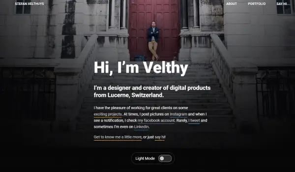
HotDot, Velthy and OregonGridiron featured in our list above are two very good minimalist websites examples that use dark design to great effect:
Want to set up a minimalist website using dark design?
Thanks to the popularity of dark design there are a huge range of themes suitable for black websites. We've included a couple of theme suggestions in the list above such as Parallax Pro, Neve, Minimalize and more.
Great font use in black websites
We mentioned at the top that font choice is incredibly important when considering a black website design. We have also seen above a few dark designs that we think have got the balance perfect when it comes to fonts.
Brands that have used black websites
Black websites can portray the feeling of elegance, maturity and luxury.
Colour theory says that black is associated with power and formality as well as the above. Care must be taken though as it can also be associated with evil, death, and mystery. A great designer can combine those positives and those negatives to create the effect you are looking for.
Lamborghini and BlackBerry (featured in our list) are some fantastic designs from big brands who have made black websites work for them.
Want to set up a dark web design for your brand?
Some brands, especially those who are happy to take the risk and opt for a premium, refined look can look amazing as dark websites.
So if you prefer lively black websites, the following themes that you can use deliver on every count, check out EXO above.
Want to use dark or black designs on your next website?
If you have taken inspiration from any of these examples and want to join the dark side on your next website, we've included as part of our list a few theme suggestions you could use.
Frequently Asked Questions
What are black websites?
Black websites and dark website design is a concept where the colour scheme of a website is dark or black. While most of the text will be a light colour, the overall scheme is dark or completely black. Black design is typically associated with premium or luxury brands. You'll find that many premium brands use a dark themed website.
What do black or dark colours signify in colour theory?
Black is a mostly neutral colour, however it is typically associated with power, elegance, and formality. It is also associated very much with rebellion. It is commonly used in edgy designs, as well as very elegant designs. Black or dark websites can be either conservative or modern, traditional or unconventional, depending on the other colours that it is combined with. Black can make it easier to convey sophistication in design.
What types of websites are typically black or have a dark color schme?
A black website is typically quite a bold design decision, so brands with bold personalities are typically the ones that opt for this color scheme. Premium or luxury brands are also synonymous with black color schemed websites. Examples of niches would be photography and art websites, ecommerce sites, luxury cars, fitness websites etc.
Does a dark design scheme affect readability?
No, there is no research or science to back up the opinion that a dark design is not good in terms of usability and readability. Reading light text on a dark background does not strain the eyes, so much so that most devices and platforms today support dark mode natively. Even for text heavy industries such as software development, dark backgrounds have been the norm for years.
Conclusion on black / dark website design
In the end, what kind of design – dark or light – you should use for your business depends on your personal preference, the brand, service or product in question and your target market.
If you want to give your visitors an energetic and vibrant look or want to appear luxurious or premium, black websites can work. If you want to evoke a feeling of mystery, of exclusivity or want to make your visitor feel elite, black website designs and dark website design can work.
As long as you follow the tips in this article on page balance, whitespace, font choice, image quality and design, your next dark design could be the best you have ever produced!
Have an opinion on black websites or dark web design? Tell us about it in the comments section below!

