It's not uncommon for things to just fall into place. A simple concept with a quick turnaround, and it just works.
While you may not know the name Rob Janoff, we are convinced that you are familiar with his work. What basis do we have for this? He designed the distinctive Apple logo, which is still used to represent one of the world's top corporations today.

More about the Apple logo story may be found on Rob's website, but it goes something like this:
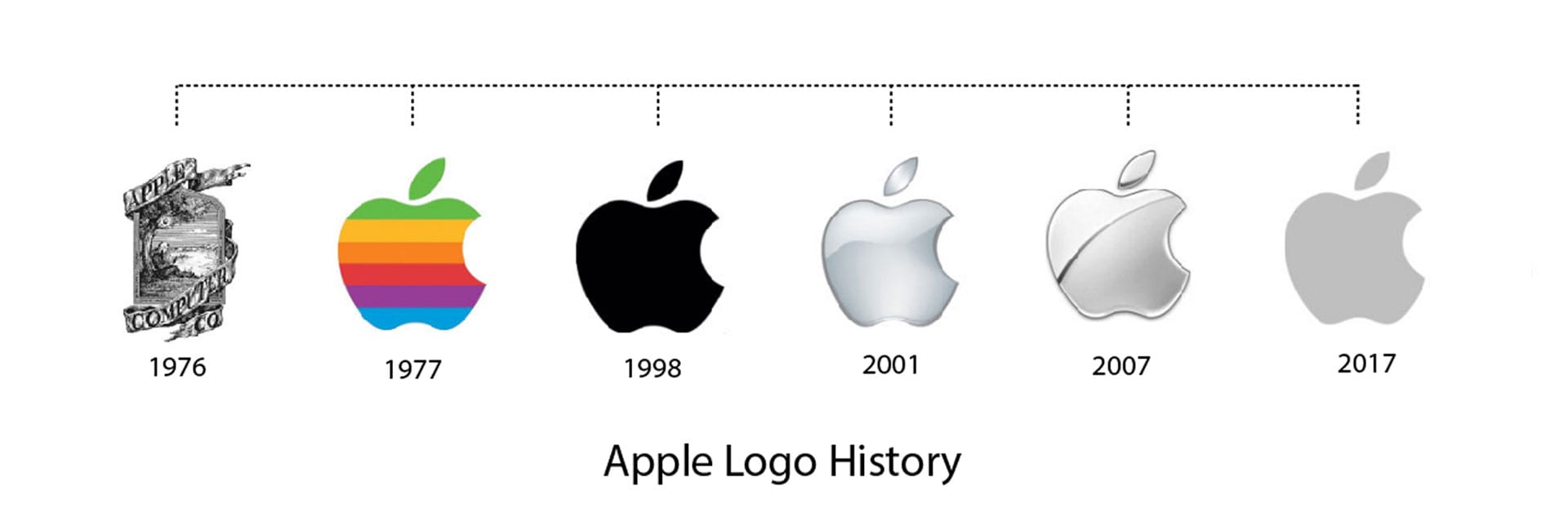
‘The initial identity development was to coincide with the introduction of the brand’s first personal computer, the Apple II. The entire design process with the upstart client only took about two weeks. After the agency’s initial meeting, Janoff went to work developing the Apple icon based on his examination of physical cross-sections of real apples. A single design illustration was then created of a ‘rainbow-striped’ apple.
The design with its multi-colored stripes was promptly approved for production by Steve Jobs. Production artwork was then developed for print ads, signage hardware emblems and software labels on cassette tapes, all in preparation for the launch of the Apple II in April of 1977 at the West Coast Computer Fair. For the next 20 years, the now famous ‘rainbow version’ logo adorned all Apple products from its computer products to the Newton PDA. The only concept ever presented to Apple was an immediate success!’
‘The creative director thought I had a good way of simplifying and visualising difficult electronic concepts. I knew all the tech kind of stuff went on in Silicon Valley but I was never enough of a computer geek to really understand how it worked.’ – Rob Janoff

Why is it that the logo is so popular and has stood the test of time? It all boils down to the fact that it covers all of the essentials of logo creation.

- It's simple, straightforward and clean
- It didn't follow the trend of the time of increasingly intricate/fussy designs
- Its use of color (now and then) ato both the market and the product offering.
- It hasn't changed much over the years – in fact, the primary design hasn't changed since the beginning – allowing the corporation to establish unrivaled brand recognition.
- It wasn't overly literal — it was an apple, but instead of selling fruit, it was selling computers;
- It didn't imitate anyone else's work.
- It couldn't have too many fonts - in fact, the logo doesn't have any words at all because the design didn't require it;
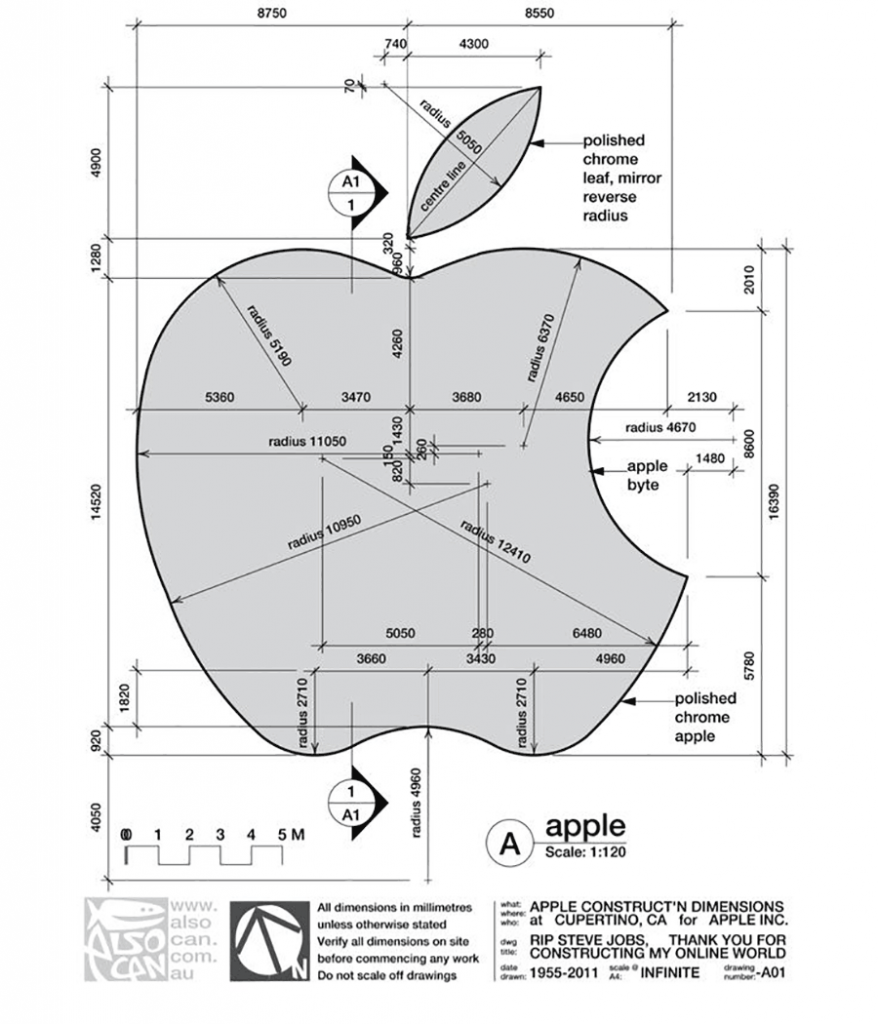
- It functioned and continues to work in a variety of contexts and sizes (from items to billboards) without sacrificing readability;
- It provided a distinct point of differentiation.
‘A lot of people ask me what it’s like seeing your logo every time you turn around. It’s a fabulous experience and it’s rare. I don’t think a lot of people get that opportunity. Watching what I created in the ’70s go through changes is kind of like having kids and watching them grow up. I’m terribly proud of my kids and I’m terribly proud of the logo as well.’ – Rob Janoff
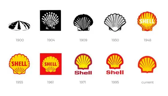
The Shell logo is another fantastic example of a single design idea evolving over time and market changes (below).

Although hardly all, if any, logo design procedures are as straightforward and quick as the one for the iconic Apple logo, it does demonstrate how a great, professional design can withstand the test of time and develop with the market.
The original design
If you look above at the original design, you'll see Isaac Newton, the guy who revolutionized science with his findings on gravity, was the first icon to represent the computer corporation. How did he discover it? An apple landed on his head! The early Apple logo depicted this incident, with Newton sitting beneath an Apple tree.
"Newton... a mind perpetually voyaging across mysterious oceans of thought," wrote William Wordsworth, a romantic English poet, in the logo. The poem was written on the logo's frame.
Download Apple Logo and Marketing Guidelines
There might be plenty of sites that feature downloads of the Apple logo, but would recommend you go directly to the source, so that you find the highest quality images, together (and crucially) the marketing guidelines for any Apple logos or imagery that you use. (Because you really don't want to get on the bad side of Apple!)
Click here to find
- Marketing resources
- Identity Guidelines
- App Store Badges
- Product Images
- Photography and Images
- Messaging + Style
- Legal Requirements
Frequently Asked Questions
Who designed the Apple logo?
Steve Jobs wanted a new logo and commissioned Rob Janoff, a graphic designer, to create one that combined the name "Apple" with a modern-looking design. As a result, the now-famous Apple logo was formed. Janoff's concept was straightforward: a two-dimensional apple with a bite eaten out of it and a rainbow spectrum across it.
Who was featured in the very first Apple computer logo?
The earliest Apple logo featured Sir Isaac Newton sitting beneath an apple tree, where he is said to have discovered gravity as an apple falls on his head.
What does the Apple logo mean?
Ronald Wayne, one of the original co-founders of Apple in 1976, designed the first logo to show the law of gravity as inspired by an apple. Isaac Newton, the guy who revolutionized science with his findings on gravity, was the first icon to represent the computer corporation.
Why is the apple logo bitten?
The logo designer Rob Janoff inserted the bite in the Apple because people found it difficult to recognise the fruit as an apple without it. In fact, the logo was frequently mistaken for a cherry.
How do you type the Apple logo on Mac?
To type the Apple logo on Mac, press the following key combination. 1) Hold down the Option key. 2) Hold down the Shift key. 3) Tap the letter K key. The result is .
Can I use the Apple logo?
Because the Apple logo is such an integral part of the Apple brand, there are very strict guidelines of who can use the logo and how it is used, to protect the reputation of the brand. You can find a copy of these guidelines here.
